I have been asked about the geographic distribution of the in-person early voting shifts in Florida from 2010 to 2014. Here are some quick graphs, using data through yesterday.
1. The graph of the percentage change in in-person early voting turnout, from 2010 to 2014. On the whole, fairly uniform increases throughout, with notable exceptions. (Click on the graph to get the full picture)
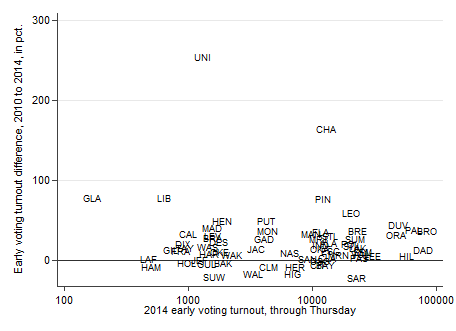 2. A simple scatterplot showing total early voting turnout in 2014 vs. 2010. Again, the plot reinforces the previous one: fairly uniform increase statewide thus far. (The labeled counties are 50% ahead of 2010.)
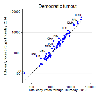
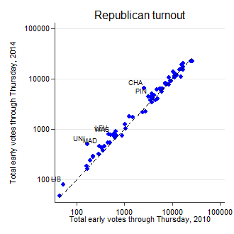
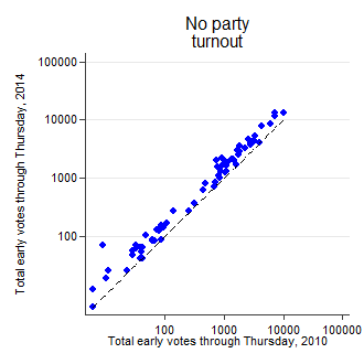
 3. Finally, in quick succession, the same scatterplot, broken down by party. The new interesting thing is the large uniform increase in early voting among those who are not registered with any party. I don’t know enough about Florida politics to know what this bodes for election outcomes. What I do know is that the big increase in in-person early voting seems to be significantly driven by this group, and not registered partisans.