Beginning today, I hope to post a weekly graphic that I have produced, or that has been produced by one of the team members of the MIT Election Data and Science Lab, that provides some new or interesting insight into how elections are run in the United States.
This week, the subject is voter confidence. This is a big topic. Lots of people make claims about voter confidence, particularly what causes it to go up or down, oftentimes tying these claims to support for some type of election reform.
In fact, the literature on voter confidence suggests that very little in the way of election reform can move voter confidence. What does move it is the election results. If your guy wins, you’re more confident than if your guy loses.
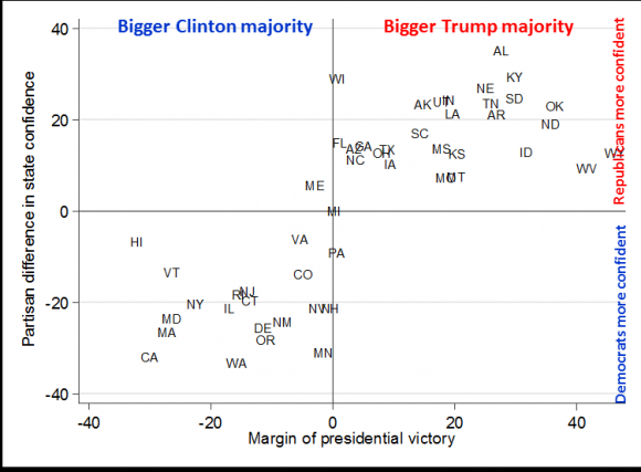
I came across a nice example of this as I was preparing for some talks at upcoming summer election conferences. The underlying measure of voter confidence is the percentage of respondents to the Survey of the Performance of American Elections (SPAE) who stated they were “very confident” that votes were counted accurately in their state in 2016. I separated those responses by the party of the respondent and then took the difference. Positive amounts mean that Republicans were more confident that votes were counted accurately in their state, negative amounts mean that Democrats were more confident.
Below you see the results. With only three exceptions (Maine, Michigan, and Pennsylvania), the more-confident partisans in a state match the party of the presidential candidate who won the state.
On average, there is a 34-point net jump associated simply with living in a state won by Trump compared to being a state won by Clinton.
There are some states with less polarization than we would expect (Wyoming, West Virginia, and Hawaii) and some with more (Alabama, Washington). Understanding why this is will have to wait for another day.
