I’ve ginned up a couple of graphs to compare early voting trends in Florida between 2008 and 2012. If you don’t want to delve into the full narrative, here is the take-away: early voting is down in Florida statewide, but somewhat more-so in counties that gave Obama the biggest majorities in 2008 (and continue to do so in 2012).
The first thing to note is that turnout is down via early voting, if we compare 2008 and 2012 at the point where there were three days left to vote early. The raw numbers are 1,364,574, with three days left to vote in 2012, compared to 1,995,399 in 2008. So, overall, early voting is down by 31.6% compared to 2008.

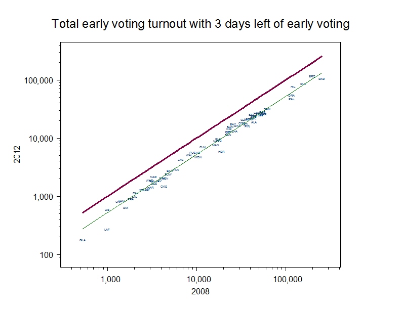
Second, the decline isn’t uniform across the state. The accompanying scatterplot shows the turnout numbers for each county, with 2012 on the y-axis and 2008 on the x-axis. (As with most of the graphs in this post, you can click on it to get a better version.) The data tokens, with abbreviations for the counties, show comparable early voting turnout the two years. The heavy red line shows turnout equality with 2008. The lighter green line shows what turnout would be, if the drop from 2008 to 2012 was proportionally equal across all counties. Obviously, it’s not. The largest county in the state, Miami-Dade, is sagging more than the statewide average.

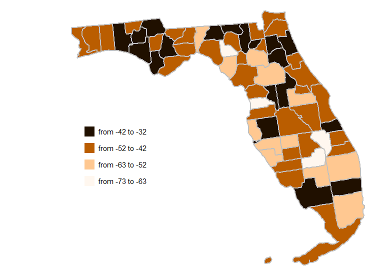
The accompanying map shows where turnout has declined, in percentage terms. I admit it’s a bit of a bear to read, but keep this in mind: the lighter the county, the more turnout has declined. In this map, it is clear that turnout is down the most in two areas Obama was counting on significantly: Miami-Dade and Palm Beach, in the southeast, and Orange County, in the center of the state. While Hillsborough and Broward Counties — strong Obama territory are among the counties with the least decline — the map is darkest in the panhandle, which is prime Romney Country.
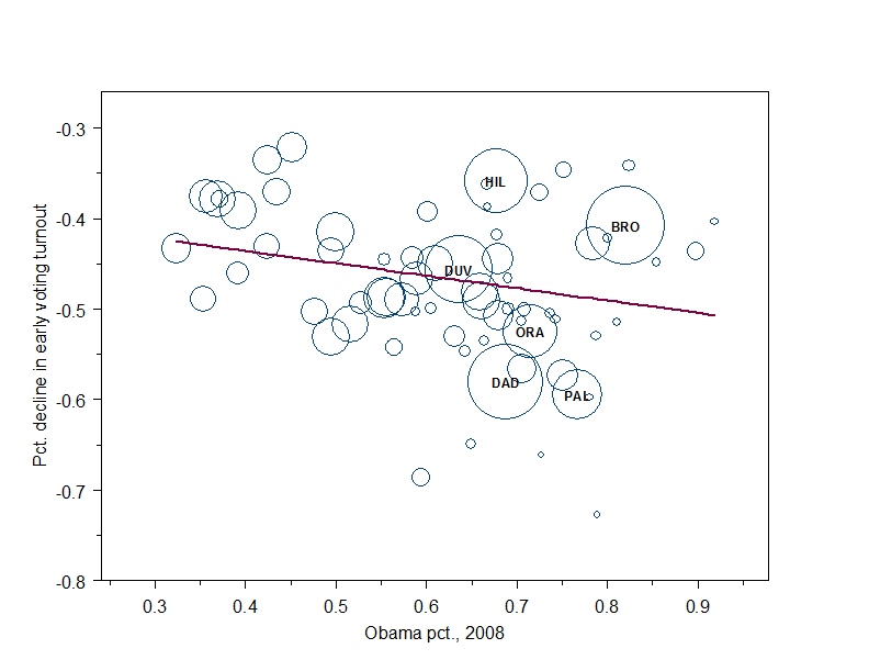
These two graphics raise the question of whether the decline in early voting turnout has, in fact, been strongest in the parts of the state that supported Obama the most in 2008. This question is easily answered with this graph, which plots the percentage decline in early voting turnout on the y-axis against the percent of the vote for Obama among early voters in 2008 on the x-axis. The red line is the regression line through the data. The data tokens are in proportion to turnout (thus far) in 2012, with the six largest counties noted explicitly.  There is a weak relationship here, but statistically significant at the traditional levels. (The equation of the line is – 0.38 – 0.14x, with standard errors of 0.04 and 0.07, respectively. R-sq = .06)
None of this analysis says why these relationships hold, nor why the decline has happened in the first place. It is very clear from the emerging statistics that people who used early voting in 2008 have not just shifted their early voting behavior to the time period they now have available to them. Reducing the number of days for early voting has clearly reduced the number of early voters. Whether these folks will end up voting elsewhere remains to be seen after the election. Whether the relatively greater decline of early voting in the strongest Obama counties is due to a strategic decision on the part of campaigns is another question, too, we will only know the answer to after the election.