Mike has posted the news that the 2012 Voting and Registration Supplement (VRS) has just been released. This is good news for election geeks all over.
One thing the VRS is indispensable for is helping track the evolution of the modes of voting throughout the country. Because there is no centralized voter registration database — at least if we don’t count a couple of commercial ventures that are off limits to the general public — there is currently no way to track how many people continue to vote on Election Day, and how many have gravitated to in-person early voting and voting by mail. The best we can do is ask people in surveys, and the CPS is the biggest of the surveys.
Using VRS data going back to 2000, I have created a set of graphs that document the decline of Election Day voting over the past decade. I have posted all the graphs in a PowerPoint deck that can be downloaded at this link. Here I show three.
The first is the most basic, a time series showing the voting modes in each federal election since 2000. Notice the steady decline in Election Day voting, with a bit of a sawtooth pattern, indicating a slight dip in Election Day voting in presidential years, compared to midterm years.
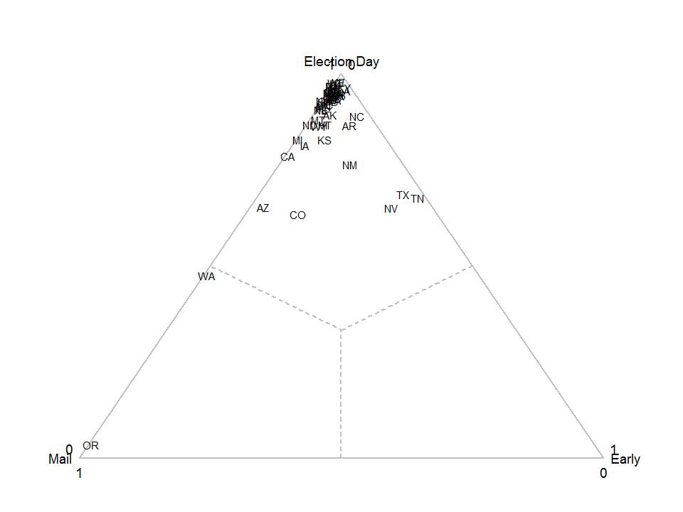
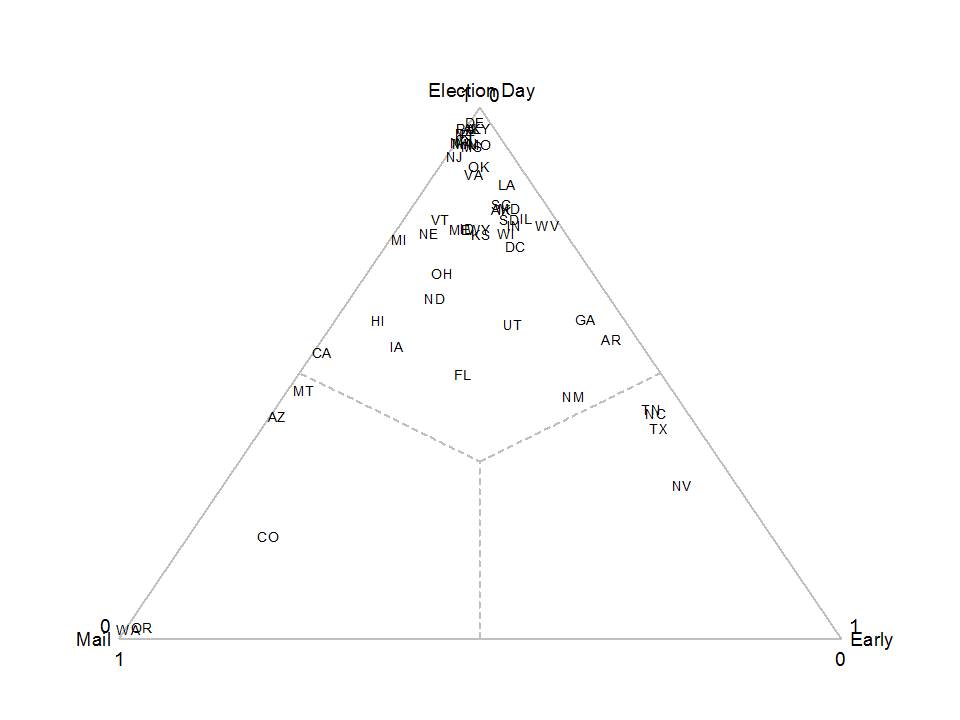
 The last two graphs show the evolution of voting modes at the state level using a favorite of mine from high school earth science, the ternary, or triangle, plot. If you don’t remember how to read these, or have never even encountered them, this is the important thing to know. States that are located at the very top of the triangle have everyone voting on Election Day. States located at the left-hand corner have everyone voting by mail. States located at the right-hand corner have everyone voting early.
Here’s 2000:
Here’s 2012:
(Download the PowerPoint deck for the complete set.) A couple of comments are in order. First, the most obvious is that the general trend has been downward since 2000, but states have chosen three paths down the triangle. A half dozen-or-so states (led by Oregon and Washington) have slid down the left side of the triangle, replacing Election Day voting with vote-by-mail. A similar number of states have slide down the right side of the triangle, choosing early voting as the method to replace voting on Election Day. Another group (led by Florida) has dropped straight down, developing a full portfolio of voting options for their citizens. The clump of states at the top of the triangle are mostly northeastern states still stuck in traditional ways of voting.
The final comment is to emphasize the fact that these are estimates, and thus likely to be off by a few percentage points for each state. Thus, the real insights are gained by noticing the general regions in which states fall, rather than trusting the precise location of each state in the graph.
Like I said, election geeks are happy.

