This weeks’ graphic was inspired by last week’s special elections for vacant U.S. House seats. Most of the attention was paid to the Georgia 6th, so let’s look at the South Carolina 5th.
One of the things that always interests me is whether surprising results of elections are due to voters changing their behavior (compared to prior elections), or because the composition of the electorate changed. This is, of course, a question that can only be answered definitively with individual-level data — and only if we know, for sure, how the same people voted in the past and in the present. Absent the individual data, we only have aggregate data.
We start with the fact that there appeared to be a pretty uniform swing at the precinct level, from the November general election (measured by the Trump vote) to the special election amounting to 5 percentage points.
While we cannot know whether some Trump voters came over to support the Democrat, Archie Parnell, it does appear that Parnell was helped (and thus the Republican Ralph Norman was hurt) by a shift in turnout. This is illustrated in the following graph, which plots the percentage change in turnout at the precinct level (comparing the special election to the general) against the two-party fraction of the vote received by Trump. The dashed line is the best-fit line based on a weighted linear regression. The solid horizontal line shows the average change in the turnout rate across the whole district.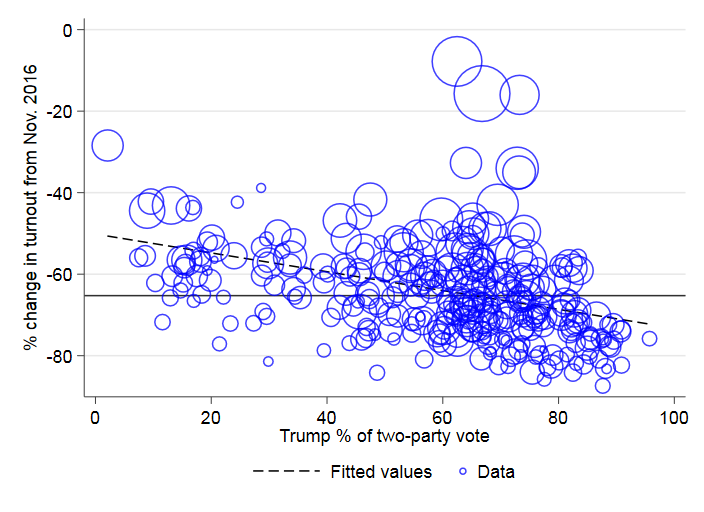 On the whole, there’s a pretty healthy negative relationship between Trump’s support at the precinct level and change in turnout. In other words, turnout in the special election tended to slump the most the in precincts that gave Trump his biggest margins in the district.
By how much did this turnout differential affect the election outcome? A simple back-of-the-envelope calculation can be done to answer this question. If we take the percentage of the vote received by Norman in each precinct and re-weight each precinct’s contribution to the district vote total by November 2016 turnout, then Norman gets 54% of the two-party vote, rather than 52% — a small, but still significant difference.
One final detail about the graph. There are obviously three outlier precincts in the graph — two precincts from Lancaster County (identified as Lake House and The Lodge in the election returns) and one from York County (Laurel Creek). If anyone has information about why turnout in these three precincts held firm in comparison with last November, I would love to hear it.