Here is a little bit of evidence about the incumbency advantage in the Virginia House of Delegates race last Tuesday.
The results of the Virginia House of Delegates (HOD) on Tuesday took many observers by surprise, producing Democratic pick-ups that only the most optimistic anticipated.
For half a century, political scientists have been interested in the degree to which an incumbency advantage exists in legislative races, and the degree to which this advantage creates a wedge between the electoral fortunes of executives (who tend not to enjoy an incumbency electoral advantage, at least at the presidential level) and legislators. The incumbency advantage also can dampen the effects of a “wave election.” There is some evidence that such a pattern emerged last Tuesday, although to a small degree.
But first, let me define what I mean by an incumbency advantage in this context. Taking my cue from the political science literature, I define an incumbency advantage as the percentage-point premium a candidate receives in votes as a consequence of being an incumbent up for reelection. The baseline expectation is the “normal vote,” which is a measure of underlying partisanship in a district. Simply put, if there is no incumbency advantage, we expect a legislative candidate’s share of the vote to equal the candidate’s share of party identifiers in the district, at least on average.
In studying the incumbency advantage in congressional elections, it is common to use the presidential vote as the proxy for a district’s normal vote. The average deviation from the presidential vote received by co-partisan congressional candidates is one measure of the incumbency advantage. That’s the approach I take here, substituting vote for governor for vote for president.
The accompanying graphs illustrate the relationship between the votes received by Democratic House of Delegates candidates and the votes received by gubernatorial nominee Ralph Northam.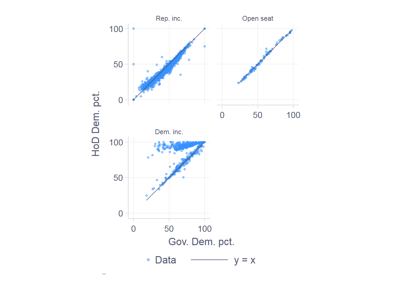 (Click on the graph to get a bigger image.) Each graph represents one of three types of races: (1) Republican incumbents running for reelection, (2) No incumbent running for reelection (open seat), and (3) Democratic incumbents running for reelection.
Each data token represents a precinct. Thus the y-axis of each graph represents the percentage of the vote received by the Democratic candidate for HOD in a precinct, whereas the x-axis represents the percentage of the vote received by Northam. The line in each graph is the 45-degree line, where we would expect the data to be if there were no incumbency advantage.
The open-seat graph (upper right) shows what we expect in the absence of an incumbency advantage: the data line up on the 45-degree line. Looked at another way, on average, Democratic HOD candidates under-performed Northam by only 0.32 percentage points in these precincts.
The Republican-incumbent graph shows two data regions. The points along the bottom of the graph are the precincts where the Republican HOD incumbent was unopposed. We’ll focus here on the other data region, close to the 45-degree line. These are cases where incumbent Republican HOD members were opposed by a Democrat.
This part of the Republican-incumbent graph shows systematic under-performance among Democratic HOD candidates, compared to Northam, for most ranges of Northam’s support. The main exception is in Northam’s weakest precincts, where HOD candidates over-performed, which is a nice example of regression toward the mean. In these contested Republican-incumbency districts, the average HOD Democratic candidate under-performed Northam by 2.7 percentage points.
The Democratic incumbent graph also shows two data regions. The cloud at the top of the graph represents cases where a Democratic HOD candidate had no Republican opponent, but saw token opposition from write-in or other-party candidates. The cloud near the 45-degree line represents races where a Democratic HOD candidate had a Republican opponent. In these races, Democratic HOD candidates under-performed Northam by a mere 0.14 percentage points. Let’s call it zero.
It’s interesting that Democratic incumbents running opposed enjoyed no incumbency advantage, while Republican incumbents running opposed seemed to enjoy an advantage of nearly 3 points. Of course, what’s not included in these simple incumbency advantage calculations is the fact that so many Democrats ran without a major-party opponent — 27 versus 12 Republicans.
Two counterfactuals
There are two interesting counterfactuals to entertain here. The first is to ask, what would have happened if all HOD incumbents had been challenged?
The simplest way to start asking this is to examine Northam’s performance in the uncontested districts. In only one of the Republican districts (the 76th, Represented by Republican Chris Jones) did Northam out-perform Gillespie, by 5.7 percentage points). Thus, by the numbers, this is one that got away from the Democrats. There was no unopposed Democratic HOD incumbent whose district gave a majority to Gillespie.
The second counterfactual is to ask if any other districts could have flipped to the Democrats if the average Republican didn’t enjoy a 2.7 point incumbency advantage.
Here, we can answer this by examining the victory margins (as of election night) and see if any Republican incumbent won by fewer than 2.7 points. There are only three districts in this range—the 94th, 40th, and 27th—, and they are all involved in a recount. Thus, if Republicans retain control of the House of Delegates, they can thank the incumbency advantage.
One final empirical point. Last night I tweeted out that the incumbency advantage appeared to be about 1.7 percentage points. That estimate was based on a standard regression-based model that assumes the advantage is the same in magnitude for both parties. Obviously, the analysis presented in this post suggests otherwise.