Charles Stewart III
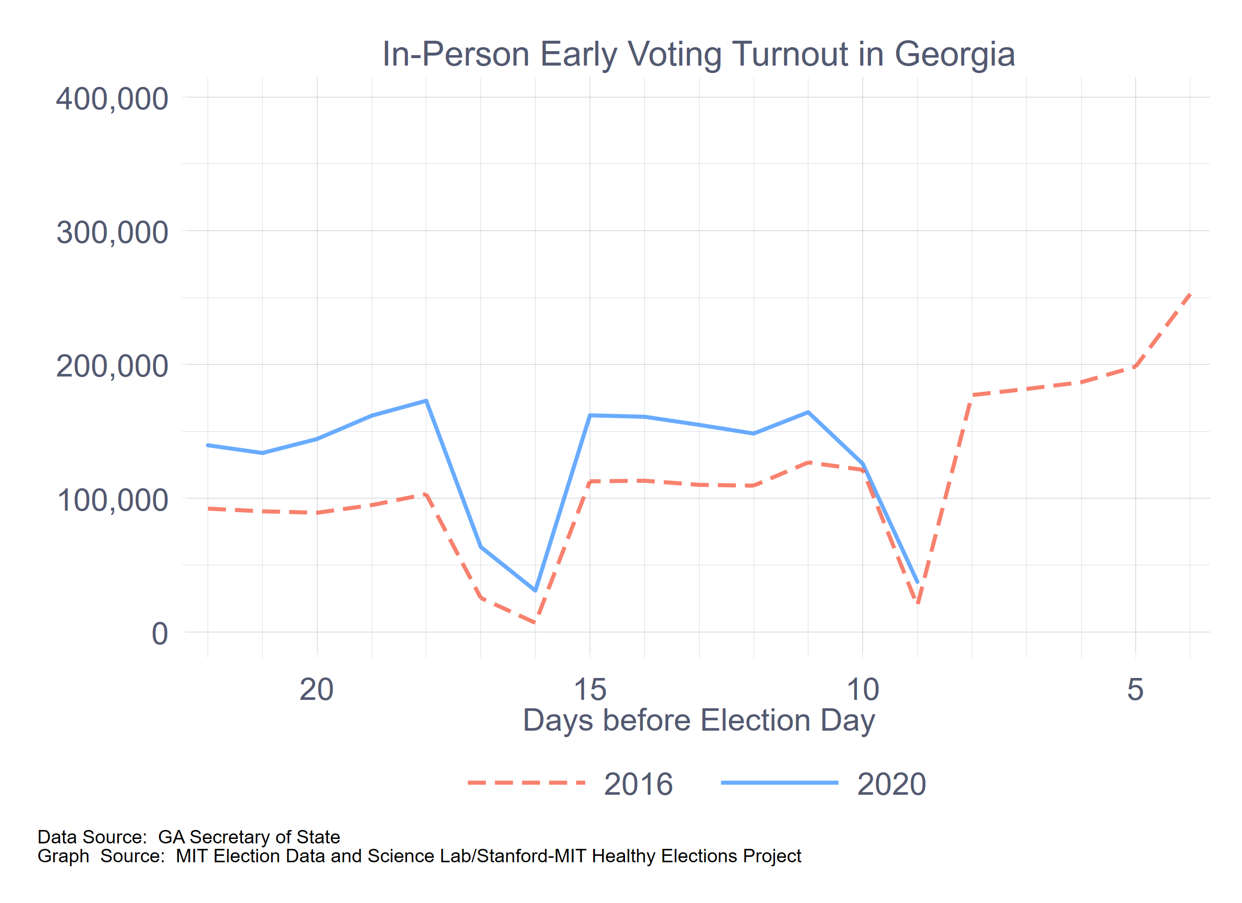
It’s just over a week before the election. The Healthy Elections Project has been running a series of surveys in half a dozen battleground states, asking the intention of registered voters about how they intend to cast their ballots. I have previously published thoughts on North Carolina and Wisconsin, with a bonus posting about Georgia (where we are not surveying, ourselves, but have survey evidence from elsewhere.) This brief note focuses on Florida.
To summarize what follow, if we make reasonable assumptions about turnout and take the survey results as a starting point, the actual pace of mail and early voting exceeds what we would expect, which also means that estimated votes on Election Day seem way too small. To make the math work, we either need to assume that turnout will be around 11.5 million (a 20% increase over 2016, which would be astonishing), that this coming week will see a throttling back on the pace or early and mail balloting, or that survey respondents have been significantly under-reporting their intention to vote on Election Day. Alas, we won’t know which explanation holds until Election Day, by which time it will be too late to do anything about it.
First, as to the intentions themselves. The table below shows that there was very little movement in reported intentions across the first four waves of the surveys, but in the last one, there was a clear decline in reported likelihood of voting on Election Day, associated with an increased tendency to prefer voting by mail. Although an ANOVA test fails to reject the null hypothesis that the percentages from the four waves come from different underlying distributions, the apparent break in mid-October suggests that it might be useful to consider the last set of results separately.
|
Vote mode intention among likely voters, including don’t knows |
|||||
|
Date |
Election Day |
Early |
|
Don’t know |
N |
|
Sept. 4 – Sept. 11 |
29.2% |
24.5% |
41.8% |
4.5% |
493 |
|
Sept. 16 – Sept. 25 |
29.5% |
30.3% |
38.2% |
2.1% |
486 |
|
Sept. 30 – Oct. 9 |
25.7% |
32.2% |
39.7% |
2.4% |
489 |
|
Oct. 14 – Oct. 21 |
21.3% |
31.2% |
46.6% |
0.9% |
492 |
|
Total |
26.4% |
29.5% |
41.6% |
2.5% |
1,960 |
|
Vote mode intention among likely voters, excluding don’t knows |
||||
|
Date |
Election Day |
Early |
|
N |
|
Sept. 4 – Sept. 11 |
30.6% |
25.6% |
43.8% |
471 |
|
Sept. 16 – Sept. 25 |
30.1% |
30.9% |
39.0% |
476 |
|
Sept. 30 – Oct. 9 |
26.3% |
33.0% |
40.7% |
477 |
|
Oct. 14 – Oct. 21 |
21.5% |
31.5% |
47.0% |
487 |
|
Total |
27.1% |
30.3% |
42.6% |
1,911 |
(By the way, the overall 95% confidence interval for all four waves combined is around +/- 2.2 points. For any one wave, it’s around 4.4 points.)
Second, to convert these expectations to raw numbers, we need an estimate of turnout. I’ve done this in two ways, as I have for all the states in the previous memos. The first is just to assume that turnout is 10% above the 2016 turnout level of 9,580,489. This would place 2020 turnout at 10.5 million. The second uses a very simple linear regression to predict the log of turnout in terms of the log of registered voters in the most recent six presidential elections, and then extrapolating based on the coefficients derived from that regression. This gives us an estimated turnout level of 10.8 million. (For those paying close attention to the various posts on this subject, the difference between the two estimates are the tiniest yet.)
Third, here is what the combination of numbers above imply for the final distribution of votes in Florida, by mode:
|
|
Vote mode, combining four waves of survey |
|
Vote mode, using last wave of survey |
||||
|
Assumed turnout |
Election Day |
Early |
|
|
Election Day |
Early |
|
|
10.5 million |
2.846M |
3.182M |
4.473M |
|
2.258M |
3.308M |
4.935M |
|
10.8 million |
2.927M |
3.272M |
4.601M |
|
2.322M |
3.402M |
5.076M |
Fourth, a final calculation needs to be made, if we want to estimate the number of mail ballots that will be requested, since not all mail ballots are returned. In the 2016 election, 86% of the requested mail ballots were returned. If this holds for 2020, then Florida should expect between 5.2 million and 5.9 million ballots to be requested.
The most recent report from Florida, which is updated to yesterday (October 25) states that 5,988,213 mail ballots were either unreturned or had been counted, which I take to be the estimated number of mail ballots that have been requested. Because the deadline to request mail ballots has now passed, it seems that the number of mail ballots requested will be just above the upper level estimated here.
Also, as of this writing, 3,805,775 mail ballots have been returned. Over the past week, Florida has been receiving an average of 173,000 mail ballots each day. If this pace continues—and we actually can expect for the pace to quicken—Florida would have 5.1 million ballots in hand by election day, which is also just above the upper limit of the estimates here.
This brings us to early voting. Over two million Floridians cast ballots in the first week of early voting, with seven more days to go. Even at this pace, Florida will see more than four million early votes—and we know that the early voting pace will pick up, too. Thus, early voting is likely to exceed even the upper bounds of these estimates by around 600,000 voters.
These early voting estimates can be summarized in the following graph:
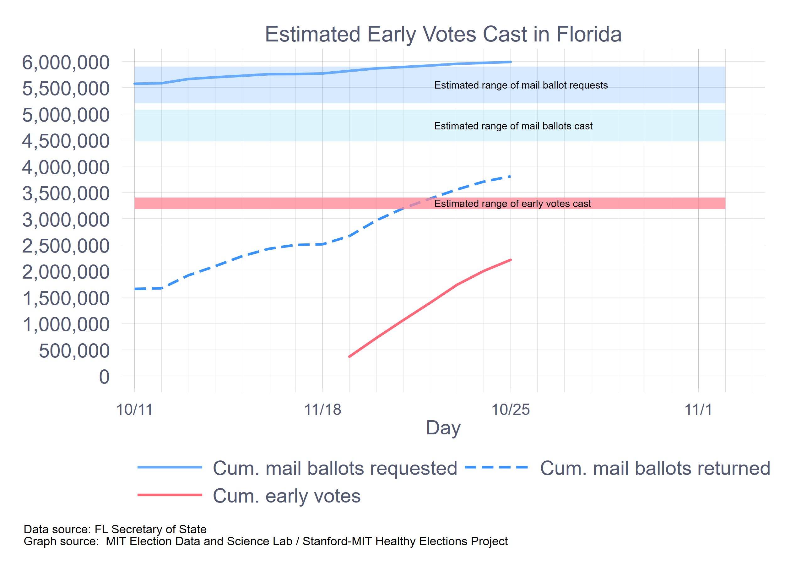
As noted, Florida is already right above the high end of these estimates for mail ballots and is on the way to do the same for early voting. Where does this leave Election Day?
Let us assume a turnout level of 10.8 million. If we subtract 5.1 million mail ballots and 4.0 million early votes, which is the path the state is currently on, that leaves a paltry 1.7 million ballots to be cast on Election Day. That’s an astonishingly small number, by any standard. Of course, it all depends on the turnout model and the accuracy of the extrapolations I’ve been suggesting. Here are some additional thoughts.
- A 10% increase in turnout over 2016 is already pretty bit, but what if it’s even bigger, at 20%? Then, we’d expect 11.5 million to vote, leaving 2.4 million to vote on Election Day. That would get us to the lower range of the estimates, but only because we’ve assumed an astounding turnout level.
- What if the early- and mail voting are more front loaded than in past years? In that case, the pace of mail and early voting might throttle back in the next week, giving more space for Election Day voting.
These two thoughts take off from the current level of mail and early voting and question whether certain assumptions are right. It’s also the case that we could go back to the survey responses and ask why the proportions voting using the four modes is so off, especially the first three. That’s the subject of another post. A favorite hypothesis of mine right now is that both Democrats and Republicans have been responding to these polls reflecting on the clear preferences of their party’s political leaders. If so, then it does raise important questions about using survey research to anticipate voter behavior in the realm of election administration.