Author Archives: cstewart

Ballots to be counted probably won’t help Clinton much

Ned Foley and I recently published two pieces of commentary, here and here, about ballots counted following election day.  Most people don’t realize this, but the election results released election night are unofficial, and are subject to updating and correcting.  Important to the updating is the counting of provisional ballots and mail-in ballots that are considered in the days leading up to the official certification of results.

In these two commentaries, we described the so-called “blue shift” that has been evident in vote counts since 2000.  The blue shift is a term given to the pattern we see, which is that the nationwide vote share has tended to shift a little bit toward the Democratic presidential candidate after election night.

A natural question to ask is whether the late-counted ballots are sufficient in this election to switch any of the states that have currently been called for the candidates.  The answer at this point seems to be “no.”  But,  New Hampshire — a state that is currently “too close to call” — has a margin so tight that the race could conceivably go either way.  (As of this writing, Clinton is ahead of Trump in the counting by 1,371 votes, out of roughly 700,000 cast.)

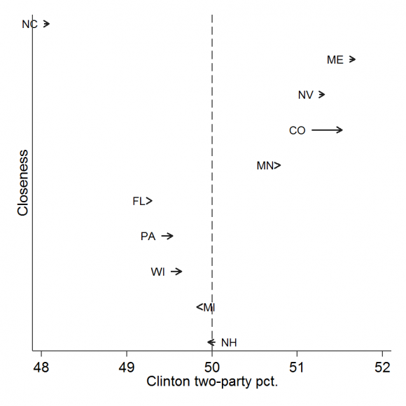
I have done some quick analysis, in which I’ve taken the current vote totals (as of 9:30 Wednesday morning).  I have then gone back to the 2012 presidential returns and compared the final, official results with the unofficial returns reported Wednesday morning following the election.  Taking this as an estimate of the “blue shift” we might expect in the coming days, I then add this to the current unofficial results to see how much the current preliminary tally might change in the coming days.  The following graph summarizes the results.

closeness

I’ve shown the ten states with the closest vote margins.  The arrows start with the current two-party vote share for Clinton and then add to it the fraction of the vote received by Obama in 2012 during the post-election counting period.

Note that only New Hampshire is close enough to 50/50 that the final count could flip the results from one candidate to the other.  The bad news for Clinton here is that New Hampshire actually experienced a “red shift” in 2012, so that this scenario predicts that the vote counted post-election would be to Trump’s advantage. (Because NH is an election day registration state, it’s later-counted ballots are dominated by absentees and late-arriving counts, not by provisional ballots.)

This is not to suggest that 2016 will be a repeat of 2012.  But, it is to suggest that the presidency in 2016 is probably not going to be decided in the canvass period.

“Rigged election” rhetoric is having an effect on voters — just not in the way you think.

Donald Trump’s relentless messaging about a “rigged election” is having an effect on the confidence voters have that their votes will be counted accurately.  But, it’s not the effect you think.

I came to this conclusion as I was considering yesterday’s Morning Consult poll results about confidence in the vote count.  It so happens that I asked almost exactly the same question on a national poll during the pre-election period in 2012.  (I can’t take all the credit.  My colleague at Reed College, Paul Gronke, joined me in sponsoring a “double-wide” module on the 2012 Cooperative Congressional Election Study.)  I decided to compare what Morning Consult found today with what we found almost exactly four years ago.

The results were surprising.  The percentage of respondents who say that they are “very confident” that their own votes will be counted accurately is virtually unchanged from 2012.  Confidence that votes nationwide will be counted accurately has, if anything, increased since 2012.  Trump’s rhetoric appears not to have reduced Republican confidence in the accuracy of the vote count over the past four years.  Rather, it has increased the confidence of Democrats.  The degree of party polarization over the quality of the vote count has increased since 2012, but it is Democratic shifts in opinion, not Republican, that are leading to this greater polarization.

Let me sketch out the background here.  In 2012, Gronke and I coordinated our modules in the CCES to ask a series of questions about election administration to a representative sample of 2,000 adults.  Two of these questions were:

  • How confident are you that your vote in the General Election will be counted as you intended?
  • How confident are you that votes nationwide will be counted as voters intend?

The first question was asked of respondents who reported they intended to vote in 2012; the second question was asked of all respondents.

The response categories for both questions were (1) very confident, (2) somewhat confident, (3) not too confident, (4) not at all confident, and (5) I don’t know.

The corresponding Morning Consult questions were:

  • How confident are you that your vote will be accurately counted in the upcoming election?
  • How confident are you that votes across the country will be accurately counted in the upcoming election?

The response categories were identical to ours, with the exception of an additional “no opinion” option with Morning Consult.

So, while the questions are not 100% identical, they are close enough to allow some meaningful comparisons.  (For those interested in a more systematic example of how similar survey research questions can be combined in this type of analysis, see the article I co-authored with Mike Sances, which appeared last year in Electoral Studies.)  Both the 2012 and 2016 studies were conducted about three weeks ahead of the general election, so the timing couldn’t be better.

In the table below, I compare Morning Consult’s 2016 results with Gronke’s and my results in 2012.  The numbers in the table are the percentages of the indicated respondents who gave the “very confident” response.

Your own vote Votes nationwide
2012 (Gronke/Stewart) 2016 (Morning Consult) 2012 (Gronke/Stewart) 2016 (Morning Consult)
All registered voters 41% 45% 16% 28%
Democrats 47% 59% 20% 43%
Republicans 42% 41% 13% 18%

The 2012 patterns were consistent with what my colleagues and I have regularly reported:  the “winning” party tends to be more confident than the “losing” party and voters tend to be much more confidence of their own votes being counted accurately than votes nationwide.


The 2016 patterns are similar, with a couple of major differences.  The most important similarity is that respondents in both 2012 and 2016 were more confident their own votes would be counted accurately than votes nationwide.  In 2012, the local-nationwide gap was 25 percentage points (41% vs. 16%); in 2016, the local-nationwide gap dropped to 17 percentage points (45% vs. 28%).


The most important changes come as we look down the table, at the Democratic-Republican differences.  Republican and Democratic opinions have changed in very different ways since 2012.  At the local level, Republicans remain about as confident as they were in 2012, but Democratic confidence has grown.  As a consequence, the Democratic-Republican gap in the confidence about local vote counting has grown from 5 percentage points to a much more substantial 18 percentage points.


In assessing the accuracy of the vote count nationwide, Republicans are actually a little more confident in 2016 than in 2012 (18% vs 13%), but this small change from 2016 is likely due to subtle differences between the two studies.  On the other hand, Democrats have become a lot more confident.  They are now a whopping 23 percentage points more confident than in 2012 that votes will be counted accurately nationwide (43% “very confident” vs 20%).


Much more work needs to be done on this issue, but a couple of tentative conclusions seem in order.  The first is that Donald Trump’s complaints about a “rigged” electoral system most clearly reminded his strongest supporters of what they already believed.  It is much less clear that Republicans who were not already convinced of the corruption of the election system have now had a change of heart.


The second conclusion is that Trump’s charges appear to have counter-mobilized Democratic opinion in novel ways.  Democrats have come to the defense of vote counting, not only in their own back yards, but even in other people’s back yards.


Either way, summary judgements about the legitimacy of the electoral process have become more polarized in 2016 than they were in 2012.  One possibility is that as time progresses, support for the electoral process as a whole will become associated with the Democratic Party in the public’s mind, with opposition associated with the Republican Party.  I am hoping that this is not the case, because we have seen important bipartisan improvements in the world of election administration over the past four years, despite continued partisan differences over voter ID laws and amending the Voting Rights Act.


We certainly need to be concerned about undermining the legitimacy of elected officials, especially in circumstances where there is no hard evidence of election rigging going on.  But, we also need to recall that once the November election is done and gone, elections will continue to be administered at the state and local levels.  The danger for election administration with all this unsubstantiated talk about fraud is that it will undermine the comity that has often existed in handling the day-to-day details of running elections.  In other words, the failure to institute improvements to local election administration will become collateral damage of this heightened polarization.


Two new election science pieces in Political Analysis

Two new methodological pieces that will be of interest to students of election administration just came out in Political Analysis, (which is edited by my VTP-co-conspirator, Mike Alvarez).

(Warning to my non-academic followers:  serious math is involved in these papers.)

The first, by Kosuke Imai and Kabir Khanna, is entitled “Improving Ecological Inference by Predicting Individual Ethnicity from Voter Registration Records.”  In a nutshell, there are a lot of times when we need to know the race of registered voters, but we don’t have race as a data field in the voter file.  (This is true in all but a handful of states.)  Some people have dealt with this problem by relying on proprietary modeling techniques, such as that employed by Catalist, and others have simply used Census Bureau lists that classify last names by (likely) ethnicity.  Imai and Khanna have developed a technique, based on Bayes’s rule, to combine a variety of information, ranging from the surname list to geocoded information, to produce an improved method for modelling a voter’s ethnicity.  The technique is tested using the Florida voter file, which has race already coded, to make “ground truth” comparisons.

The second, by Gabriel Cepaluni and F. Daniel Hidalgo, is entitled “Compulsory Voting Can Increase Political Inequality:  Evidence from Brazil.”  This article will definitely be relevant for those interested in proposals to institute mandatory voting in the US.  Brazil is the largest country in the world with mandatory voting, which makes this case of particular interest.  Cepaluni and Hidalgo show that the causal effect of making voting mandatory is to increase SES disparities in turnout.  The reason is that the non-monetary penalties for non-voting primarily affect voters with higher incomes.

Happy reading!


The mystery of the Brooklyn voter reg “purge”

Reports from Brooklyn about the “purge” of  over 125,000 voters between last November and the recent presidential primary has turned the spotlight on the maintenance of voter lists. Today’s news brings word that the Kings County Board of Elections’ chief clerk apparently erred by removing voters from the rolls contrary to law.

Pam Fessler’s excellent NPR report on Wednesday about the rules governing removing voters from the rolls makes the point that the laws governing voter list maintenance are pretty clear.  Voters (and reporters) don’t always understand those rules, and when they do, they don’t necessarily agree with them.  For that reason, I’m going to sit back and wait for the reports of the New York City Comptroller and state Attorney General before passing judgement on what exactly happened and who was at fault.

That said, the whole story remains a bit of a mystery, first, because statistics about New York’s list maintenance activities are opaque and, second, no one really knows how many people “should be” on the voting rolls and, therefore, how many people “should be” removed when list maintenance activities are done.

New York’s murky voter registration statistics

On the issue of statistical opacity  Every two years, the U.S. Elections Assistance Commission is required by the National Voter Registration Act (NVRA) to issue a report about voter registration activities at the state level.  (Here is a link to the post-2014 report.)  To prepare the report, the EAC sends a survey to the states asking them to report, at the county level, statistics that describe the number of voters removed from the rolls, and why they were removed.  (The three major categories of removals are “failure to vote,” “moved from jurisdiction,” and “death.”)  In recent years, most states have complied with the request to provide this detailed information, but not New York.

As recently as 2008, New York only reported statistics for the whole state, not for individual counties.  In 2010 and 2012 New York finally started providing county-level statistics to the EAC, but the state backslid in 2014, providing no detailed breakdown for why voters were removed from any county in the state.  Not only that, but New York reported that between the 2012 and 2014 elections, only 47,634 voters had been removed from the rolls statewide, which is approximately the same number removed by Delaware.  (To provide further perspective, Florida removed over 484,000 voters and Pennsylvania removed over 853,000.)

Over the past few days, many people have asked me if the number of voters removed from the rolls in Brooklyn was unusual, to which I have to answer, “who knows?” because the relevant list maintenance statistics from New York (meaning the whole state, not just the city or one borough) are not being made public, as they are for most of the rest of the nation.

We don’t know how many people “should be” on the rolls

On the issue of how many people “should be” on the rolls and how many “should be” removed by list maintenance activities every year:  It turns out that this is a very hard question to answer. One attempt to answer this question was made in a recent conference paper that I wrote with a Harvard graduate student, Stephen Pettigrew.  (You can download the paper at this link.)  Because there is no national registry of all eligible adults (at least one that is available to the public) and no single national voter registration list, we don’t know the “true” number of registered voters.  (By “true number,” I mean people who are eligible to vote in the state in which they are registered, which excludes people on the rolls who have moved or died.)  Thus, official voter registration lists are, to some extent, “too big,” but by how much is currently unknown (and hotly contested among various groups).

Even so, it is possible to get an approximate sense of how many voters should be removed from the rolls on an annual basis, since there are two reasons that dominate all others:  moving out of a jurisdiction and dying.  Let’s see where Brooklyn (Kings County) stands on those measure.

WARNING:  Detailed calculations involving math follow

Deaths are easy.  The Centers for Disease Control maintain a database that records the number of deaths in each county of the United States, broken down by age.  In 2014 (the most recent year for which statistics are available), Kings County recorded 15,347 deaths among those 20 years and older.  (Unfortunately, the CDC database breaks down population groupings in five-year intervals, so we can’t add the deaths of 18- and 19-year-olds.  But, given the nature of death statistics, this is not a large number of people.)

Moving is a little more tricky, because there isn’t a national registry of movers, and the Census Bureau data is cumbersome to use to estimate how many people have moved out of a county or state.  However, the IRS (who knew?) provides data about county-to-county migration, based on income tax filings.  It can be used to estimate how many people move out of Kings County each year.

From what I can tell, between 2013 and 2014 (the most recent data available), about 110,000 people moved from Brooklyn — over 59,000 moving to other counties in New York and over 50,000 moving to other states.  Not all of these are registered voters, of course, or are all of them eligible.  The Census Bureau tells us that there were roughly 2.0 million residents in Brooklyn in 2014 who were 18 and older, out of the borough’s 2.6 million residents.  If all of these adults were registered, my back-of-the-envelope calculation suggests that you would have about 60,000 registered voters from Brooklyn moving somewhere else in New York each year and about 51,000 registered voters moving out-of-state.  The out-of-state movers should certainly be removed from the rolls (eventually); the in-state movers would presumably be removed from the Kings County rolls eventually, but would reappear on the rolls of another county.

However, the most recent official reports from the state indicates that there are only between 1.3 and 1.4 million registered voters in Kings County, depending on which set of statistics you trust (last November or this April).  Either way, my back-of-the-envelope calculations suggest that with this more reasonable estimate of how many registered voters there actually are in Brooklyn, you probably have only about 39,000 registered voters moving within New York in any given year and 33,000 moving out-of-state.  And, if people who die are registered at the same rate as those who survive another year, that gives us only about 10,000 deaths that need to be taken care of each year.

This is a long way of saying that the only way you could get 125,000 voters removed from the rolls in a year (assuming that list maintenance happens annually) is if everyone eligible to vote is registered and if everyone who moves and dies is then taken off the rolls.  More likely, if only about 60% of eligible voters are registered in Brooklyn, then the expected number of removals would be in the range of 40,000 to 80,000 voters each year.

As a side note, in 2014, Kings County reported to the EAC that it removed only 4,548 voters from the rolls for all reasons between the 2012 and 2014 elections.  Thus, it is reasonable to infer that Brooklyn (and the rest of New York state) isn’t even removing voters who die, which should be the easiest part of the removal process to manage.

If you’ve read this far, you deserve a medal, but you should also now have a sense about why the question of how many voters we should expect to be removed via regular list maintenance activities is so unclear.  It would help if New York’s counties started reporting the same detailed list maintenance statistics as the rest of the nation.  If they did, then at least we would have a better sense about the efforts being undertaken to keep the rolls reasonably free of deadwood.  Until then, no one outside the state board of elections and the county boards will be able to judge the efforts that are going into making sure the voter rolls in New York are accurate.
 

Competing Lessons from the Utah Republican Caucus

If you want a case that illustrates the clash of expectations in the presidential nomination process, you need look no further than Utah’s Republican caucuses that have just been held.

These problems were well illustrated in two postings that recently came across my computer screen (h/t to Steve Hoersting via Rick Hasen’s Election Law Blog).  I make no claims about the accuracy of the claims (especially in Post # 1), but the sentiments expressed are certain genuine and representative.

Post # 1, a very interesting (to say the least) description of one person’s experience at the caucus, is a classic clash-of-expectations account.  In this posting, we learn that the lines to check in were long, ballots were given out in an unsecured fashion, those running the event didn’t always seem to know what’s going on, one-person-one-vote may have been violated, the ballot wasn’t exactly secret, and those counting the ballots didn’t want too many people looking over their shoulders.  About which I think, “sounds like a caucus to me.”

Caucuses are a vestige of early 19th century America, intended to pick nominees, to be sure, but with other goals in mind as well, such as rewarding the party faithful with meaningful activity and instilling control over the party base.  What we moderns value about primaries — that they are run by professionals, are designed to minimize coercion, and value access and security simultaneously — is precisely what caucuses are not.  Primaries were not gifted to Americans by a benevolent God, but were fought for by reformers over many years.  Primaries have their problems (among which is the fact that primary laws also had the [intended] effect of killing off minor parties), but it is a mistake to judge caucuses as if they were primaries.

Post # 2 is a story in Wired about the Utah Republican Party’s use of an online elections vendor to run an absentee voting process for the caucuses over the Internet. The writer’s point of view is that online voting in an election is an outrage because of the well-known problems with security and auditability of voting over the Internet.  Fair enough.  But, this is not a secret ballot election, it is a caucus.  If there is outrage to be expressed along these lines, it is for Republican leaders lending the appearance of a secret ballot election to a different sort of proceeding.

The Wired story also uncovers frustration among many thousands (probably) of would-be Internet voters that they were unable to vote because their party registration could not be verified, which may be another way of saying they were not eligible to vote in the first place, and would have been turned away from a physical caucus if they had appeared there instead.  Thus, we have another mismatch of expectations, pitting party leaders, who have every right to guard the associational rights of the party organization, against party voters, whose affiliation with the parties is one of identity rather than organizational membership.

This presidential nomination season has been infinitely interesting, one that will go down in history.  As the process drags on, moving from the high-profile early states to the low-profile middle and later states, we are seeing more and more examples of inconsistent expectations between process organizers and voters.  I suspect this will lead to an interesting round of reform activity (The Republican Party Meets McGovern-Fraser anyone?) once the dust has settled in November.


VTP released new report on polling place resources

coverJust as the one-year count-down for the 2016 presidential election has begun, the Caltech/MIT Voting Technology Project has released a new report today about managing polling place resources.  Click here for the executive summary, and here for the full report.

This report serves as a companion to a set of Web-based tools that the VTP developed and posted at the request of the bipartisan Presidential Commission on Election Administration (PCEA), to facilitate the recommendation that local jurisdictions “develop models and tools to assist them in effectively allocating resources across polling places.”

The report takes several new steps in the effort to spread the word about the usefulness of applying queuing theory to improve polling place practices.  First, it provides a single source of facts about lines at polling places in 2012 (with some updating to 2014).  Second, it provides a brief, intuitive introduction to queuing theory as applied to polling places — with a brief list of suggested readings for those who would like to learn more.  Finally, the report uses data from two actual local election jurisdictions and walks through “what-if analyses” that rely on the application of the resource allocation tools.

The report released today provides basic facts about where long lines were experienced in 2012 and which voters — based on race, voting mode, and residence — waited longer than others.  Information about the 2014 election updates previous research, and underscores how long lines tend to be more prevalent in on-year (presidential) elections than in midterm elections.  Beyond providing basic facts about the location of lines in American elections, the report provides a basic introduction to the science of line management, queuing theory, and a list of further readings for those who wish to delve more deeply into the subject.  Finally, this report demonstrates how the Web-based tools might be used, by working through actual data from two local jurisdictions.

The report is part of the Polling Place of the Future Project (PPOTF) of the VTP, which has been generously supported by the Democracy Fund.  Since the release of the PCEA report, the VTP calculator website has been visited thousands of times by users across the country (and around the world.)  We have received feedback from numerous jurisdictions about the utility of these calculators, as state and local officials try to effectively allocate their limited resources.

In recent months, two of the resource calculators have been updated, and those updates have been posted on the site.  The new versions include improvements to the user interfaces and the ability to upload data from multiple precincts, which allows the simultaneous analysis of hundreds of polling places for large jurisdictions.

With the one-year countdown to Election Day 2016 already underway, some might say that it is too late to make use of such analytical tools to make a difference in the next presidential election.  However, my experience is that most election administrators are always looking for ways to improve the experience for voters; thus the publication of a report that highlights how existing tools might help them prepare for November 2016 comes at the right time for those election administrators who are looking to fine-tune their plans for next year.

The more the merrier, polling-place division

At the risk of becoming Doug Chapin’s Mini Me, I’m prompted to pile on Doug’s post today about the controversy in Summit County, Ohio over whether a state senator can serve as an Election Day poll worker.

As a college professor who has now worked for 15 years to bridge the gap between academics and election officials, I can’t help but cheer on state Sen Frank LaRose, who has applied to be a poll worker, but is being opposed by half the Summit County elections board, on the theory that only “regular citizens” should be poll workers.

Leaving aside the odd spectacle of a county elections board turning down a perfectly good poll worker applicant, the perspective that only a select tribe of individuals — ordinary citizens or highly trained professionals — can acquire real hands-on experience helping to run a polling place only hurts the cause of better election administration in the long run.  If we’ve learned anything from the constant attention over the past two decades to how elections are conducted, it’s that the world of election administration is often too insular.

My own personal experience has been focused on how this insularity oftentimes means that election administration is cut off from advances in the academic, non-profit, and business worlds.  The Summit County case highlights the insularity of election administration from the legislators who fund elections and write the laws that govern them.  How many times have I heard complaints from state and local election officials about county commissioners or state legislators making decisions that just make no sense, from the perspective of the trenches?

Poll workers are called on to make myriad decisions that affect the experience of voters, including whether they get to vote at all.  What better way is there for a state legislator to understand how election laws actually get implemented than to have him go through poll worker training and then to spend the day implementing election law in a polling place?

Count me as another voice in favor of granting Sen. LaRose his request to live out next Election Day working a precinct.

Mail Ballot Drop-Off Patterns

Doug Chapin’s most recent post on his Election Academy blog tells the tale of the late delivery of 1,270 mail ballots in a recent election in Orem, Utah.  This post brings to mind a surprising result (at least to me) from the 2014 Survey of the Performance of American Elections (SPAE) about the return of mail ballots.

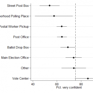
In 2014, for the first time, the SPAE asked respondents who voted by mail how they returned their ballots.  Nationwide, 2/3 of absentee and mail ballot voters returned their ballots by mail.  That’s not the surprising part.  This is what surprised me:   If we look only at respondents from the three “vote by mail” states — Colorado, Oregon, and Washington — only 1/2 of “vote by mail” voters report returning their ballots using the Postal Service.  Half the voters in these states took their ballot to an official elections site to be counted — 38% of these used a dedicated drop box, 29% went to the main elections office, and the rest went to a combination of places, including traditional neighborhood precincts and early voting centers.

Even those who used the Postal Service did not often use the convenience of front-door pick-up to return their ballot.  Only 40% of voters who used the Postal Service to return their ballot had their own mail carrier pick up the ballot.  An even larger fraction (46%) took their ballot down to the post office, while the rest deposited their ballot in the mailbox around the corner.

I have one additional point to add to this.  Ever since I started administering the SPAE in 2008, I have asked voters how confident they were that their vote was counted as cast.  Each time I have asked this, voters using the mails have expressed significantly less confidence than those who voted in-person, either on Election Day or through early voting.  In 2014, for instance, 67% of those who voted by mail (or absentee) said they were very confident their vote was counted as intended, compared to 76% of Election Day voters and 73% of early voters.

The results from 2014 help to show that this lower confidence in postal voting is related to how the ballot is returned.  The following graph illustrates the relationship.  The dots illustrate the fraction of “mail” voters who answered they were very confident their vote was counted as cast, broken down by how they returned their ballot.  The “whiskers” around the dots are the 95% confidence interval around those estimates.  The dashed vertical line shows the fraction of in-person voters who were very confident.  Note that the “mail” voters who used the various Postal Service delivery routes were all less confident than those who voted in person.  Those who returned their ballots at the mail election office, or who used a vote center, were just as confident, and maybe even more confident, in the case of vote centers.  (The lower confidence among those who left their mail ballots at a neighborhood precinct is a little puzzling, but it might be related to the fact that very few people actually leave their mail ballots at Election Day precincts, which means that precinct workers may not always know what to do with them.)

absentee_confidenceThe Orem situation shared by Doug helps to illustrate the reality behind these national statistics.  In the aggregate, voters seem to recognize that if they leave it to the Postal Service to deliver their ballot, there is some risk involved.  By their behavior, vote-by-mail voters appear to like getting their ballot in the mail, but return it by mail?  Not as much.


Last day of FL early voting is big

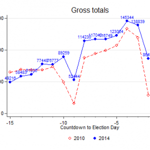
The last day of in-person early voter in Florida ended the period with a bang — total turnout on the last Sunday was about triple four years ago, and the Democratic share was even greater than four years ago.

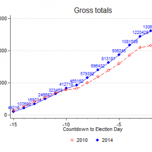
For the entire period, the relative Democratic share of the in-person early vote has been greater than in 2010. As Michael McDonald notes, the Democratic share of the absentee/mail vote is also greater than 2010. What remains to be seen is whether this is just shifting around when partisans vote, or if it reflects a shift in partisan electoral fortunes from four years ago.  It’s obviously a mix of both; we’ll know soon enough what the mix is.

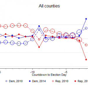
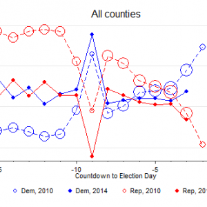
Here are the graphs.  Click on a graph to see the full picture.

Day-to-day in-person early voting turnout:

day_to_day_gross_20141103


Cumulative early voting turnout:day_to_day_cumulative_gross_20141103


Partisan composition of early voting turnout, compared to 2010:day_to_day_pct_gross_20131103

FL Early Voting through Saturday: Steady as She Goes

Here are the latest statistics for in-person early voting in Florida. The two patterns I have been following, total turnout and partisan composition, continue to hold.

First, turnout for in-person early voting continued to exceed 2010, with aggregate turnout about 20% above 2010.

Second, the partisan composition of the in-person early voting electorate has remained fairly stable.  As in 2010, there was a slight up-tick in Democratic turnout and a slight down-tick in Republican turnout yesterday.  However, in 2010, these up- and down-ticks were much more dramatic.  For those who have been trying to gauge what this means for possible outcomes, it bodes better for Scott and worse for Crist.

To mix things up, rather than show cumulative totals, I’ll show day-to-day total turnout, so that the persistence of the daily increase in in-person turnout compared to 2010 is clear. (Click on the figure for the full graph.)


day_to_day_comp_20141102

Here is the partisan composition day-to-day.  Presumably, with a souls-to-the-polls drive today, we should see a surge of Democrats in tomorrow’s graph.  It will be interesting to see how it compares to 2010.day_to_day_pct_gross_20141102