Author Archives: cstewart

Small blue shift in Alabama canvass

A few years ago Ned Foley identified a growing trend in post-election canvasses:  there is a tendency, at least in presidential elections, for the Democratic share of the vote to grow between the initial election-night count and the final, official canvass of the vote.  He referred to this as a “big blue shift,” paying homage to the association of the Democratic Party with the color blue.  Ned and I have written together on this, including a conference paper that I hope we can resurrect soon, and a Monkey Cage/Washington Post op-ed we published on the morning of the 2016 election.

While there is no claim that the blue shift will show up in every election, changes to election laws over the past two decades have created a set of ballots that require special handling, and which are often only resolved in the days and weeks following the election.  The largest set of these ballots are absentees, which have been weakly (and inconsistently) trending Democratic over time, followed by provisional ballots, which are much more regularly Democratic.

Therefore, it’s not surprising to see that Doug Jones benefited by a very small blue shift in the Alabama vote count following the recent special election.  The election night count had Jones at 49.92% of the vote, to Moore’s 48.38%, or a difference of 1.54 points.  The official canvass, which has just been certified, had Jones at 49.97% of the vote, to Moore’s 48.34%, or a difference of 1.62 points.

This is a tiny difference, but it was pervasive in the state, as the accompanying graph shows.  (If you want to read the details, I’m afraid you’ll need to print it out and use a magnifying glass.  Click on the graph to enlargify it.)

Here’s how to read the graph.  Alabama’s counties are sorted according to their election night percentage for Jones, with the most pro-Jones counties on top.  Deviations from the election night percentage are shown.  The dashed line directly to the right of the 0% line is the statewide average shift toward Jones.

It’s easy to see here how relatively uniform the shift was across the counties.  The Jones percentage of the vote increased in 54 counties, declined in 7 and didn’t change in the remaining 6.  In only 8 counties was the magnitude of the difference greater than a tenth of a percentage point, and only one of those (Mobile) could be considered a large county.  (Jefferson County, the state’s largest county, which got beat up in Roy Moore’s filing attempting to delay certifying the vote, came out almost exactly at the state average.)

Why the blue shift occurred in this particular election is still an open question.  I haven’t seen a full accounting of domestic absentee, UOCAVA, and provisional ballots yet, but would suspect that provisional ballots dominated in this case.  In Mobile County, at least, absentee ballots and provisional ballots came in 70.2% and 81.8%, respectively, for Jones, compared to Jones’s overall county vote of 57.3%.  But, that’s just one county.

Election officials often say that their job isn’t to get the vote count fast, but to get it right.  Here we see in Alabama a small example of how vote totals shift from election night to the final canvass.  Given the controversy surrounding the election, it was probably a blessing that Jones had won the election night count, even by a little, so that the blue shift didn’t enter into the post-election count.  One can only imagine what would have happened had Moore been ahead on election night…

Much ado about nothing in Alabama “fraud” charges

At the risk of being lost down a rabbit hole and subject to endless trolling, I just have to weigh in on the so-called evidence of vote fraud that was contained in Roy Moore’s court filing, in which he tried to get a delay in having the vote certified.  (The reason I decided to plow ahead is that Moore’s filing points out an interesting pattern in the precinct returns — it’s just that it’s not evidence of vote fraud.)

There are a lot of claims made in Moore’s filing, and I don’t pretend to have time to take them all on.  The one that has the look of seriousness is based on some number crunching by Philip Evans, an electrical engineer from South Carolina who has taken a look at the precinct-level election returns from Jefferson County (Birmingham) and declared them to be impossibly skewed — or, as Mr. Evans  puts it, based on analyzing more than one hundred elections, “never has there been the level of statistical proof on the scale of Jefferson County” that the results were fabricated.

What’s this proof?  It’s nothing more than calculating the percentage of voters in a precinct who voted for Moore and then calculating the percentage of voters in a precinct who voted “Republican” for the straight ticket line.  (Recall, that it was possible to vote for Moore in Alabama “without voting for Moore,” by simply voting Republican on the straight-ticket line.  Such a vote would mean a vote for every Republican on the ballot — which in this case was simply Roy Moore.)

The analysis then simply shows the distribution of this difference (Moore % – Straight Republican %) for each precinct.  Here is a screen shot of the graph Mr. Evans uses. (Click on the graph to enbiggen it.)

Every precinct on the left side of the graph had a higher percentage of voters vote straight Republican (among those who voted the straight party line for any party) than voted for Moore (among those who voted directly for the candidates themselves.)

For starters, the gist of the argument is that the figure above doesn’t follow a normal distribution, which alone is evidence of fabricated election results.  I know of no reason the distribution should follow the normal distribution.  Most of the political world isn’t distributed normally (or Poisson, or uniform, or any other favored distribution).  That’s a red herring.

The real issue is whether the relationships between variables look anomalous.  The graph above didn’t answer the question about relationships, so the first thing I did was to recast it in a way that explores the implied relationship among variables that are conflated when we just gaze at a single distribution.  So, I created a graph of the % of the vote that Moore received purely as a candidate against the % of the vote that the Republican Party got on the straight-party line.  This is what that graph looks like. (Click to enlarge.)

The data are as described in the previous paragraph.  The solid gray line is the 45-degree line.  The dashed line is a non-linear best fit to the data.  (For those keeping score, this is a lowess fit.)

Note that the red precincts — the one Moore called “anomalous” — are relatively competitive.  In fact, given that Jefferson is a Democratic county, these are relatively strong Republican precincts for the county.

So, it appeared that Moore as a stand-alone candidate under-performed in moderately Republican precincts in Jefferson County, compared to those who voted a straight ticket.

The Moore court filing suggests that patterns like this can’t be explained.  Quite the contrary.  The precincts that the Moore campaign seem so worried about are precisely the types of places that commentators were speculating about ahead of the election:  solidly Republican areas that just couldn’t stomach voting for Moore.  Also, because these are precincts where party loyalties are closely balanced, I would bet that they are full of voters that political scientists call “pivotal,” that is, voters who could go either way in an election.  Again, these were precisely the voters who were up for grabs in the special election.  And, it’s also these precincts where you might expect to find more Republicans “voting the party, not the man.”

Finally, there’s the empirical issue of how correlated “candidate-only votes” and “party votes” are at the precinct level in a less controversial election.  Turns out, they’re not as highly correlated as you would expect.  For instance, the following analysis reproduces my scatterplot, this time using the precinct election returns from Jefferson County in the 2016 presidential election.

Here, I’ve highlighted “outlier” precincts in red, using the same criterion as before.  (I.e., the red precincts are more than 20 points away from the diagonal line.)  Unlike the special election, there is a bit more symmetry on both sides of the line.  Still, Trump as a candidate was more likely to under-perform the Republican straight-ticket line than Clinton was to under-perform the Democratic line.  And, the under-performance was more common in precincts that moderately leaned one way or the other — again, the type of precinct where you might find more wavering partisans, because of the context in which they live.

So, the pattern that was used by the Moore campaign to claim fraud was different in details from 2016 in Jefferson County, but only in the details.  In 2016, both parties arguably had flawed candidates, and thus it’s not surprising we would see the parties’ candidates under-perform their party in a few precincts.  Nor is it surprising that the precincts where they under-performed would be relatively central to the overall partisan space.

To conclude, I’m the last person in the world to say you shouldn’t mine through election data looking for evidence of erroneous election returns, either due to fraud or human error.  But, finding what appears to be anomalies is just the beginning.  The next step is that the person suspecting fraud owes it to everyone to consider alternative explanations.  In the case of the 2017 Alabama special election, what appears to be anomalous is easily explained in terms of well-known campaign dynamics — and may not be as anomalous as it first appears.  Finally, any charge of fraud (or human error) needs a mechanism to hang the story on.  There was just no plausible mechanism proposed in Alabama.  (The implied mechanisms were so out-there that they don’t deserve to be mentioned.)

Doug Jones won in a fair fight.  If the Republicans want to win the seat back, they’ll have to get it back in a fair fight.


Interesting residual vote pattern in Alabama

Many people know that I’m interested in the residual vote rate, which is the  percentage of ballots that do not have a countable vote for a particular race.  A residual vote is either an over-vote or an under-vote.  Residual votes were at the core of the 2000 recount fiasco in Florida, where hanging or pregnant chad led to under-votes, and where weird ballot designs such as the “caterpillar ballot” caused over-votes.

What did the residual vote rate look like in the Jones/Moore race in Alabama?  According to preliminary election results published by the Alabama Secretary of State’s office,  of the 1,346,146 Alabamians who went to the polls last Tuesday, 1,779 cast no vote in the Senate contest.  That’s 0.13% of turnout, which is a pretty small number.  Still it’s not zero.

Why would a voter go to the polls in a hotly contested race and not vote in the contest?  There are at least four possibilities:  (1) The voter felt a civic duty to turn out, but couldn’t bring himself to vote for one of the candidates.  (2) The voter made a mistake when marking the ballot and didn’t leave a legal mark.  (3)  The machine failed to read the legal mark.  (4)  The voter turned out to vote in another contest, and abstained in the hot contest.

It turns out that reason # 4 was a major driver of the residual vote in Alabama last Tuesday.  We can see this in the following graph, which plots the residual vote rate for each county in the U.S. Senate special election.  (Click on the graph for a bigger view.)

I have labeled the nine counties that are outliers.  What sets them apart from the rest of the counties?  With the exception of Choctaw, they all had other things on the ballot, generally taxation or millage questions.  Considering how salient issues of local taxation can be, it’s not surprising that some Alabamians in the eight counties with referendum items would have shown up to vote about taxes, but not about the Senate.

How many voters might this be?  No many.  A back-of-the-envelope calculation suggests that only about 127 voters showed up in these 8 counties to vote for taxes but not for senator.

Similarly, it’s possible to use simple statistical techniques to estimate approximately what fraction of the residual vote rate was due to these additional ballot questions, or similarly, what would the residual vote rate have been if no counties had put tax questions on their ballots.  The residual vote rate In the 59 counties without tax questions was 0.06%, compared to 0.51% in the eight other counties.  A little algebra suggests that about half of the statewide residual votes in the Senate election were due to voters showing up for tax questions and skipping the Senate rate.

One final word about voting machines:  The residual vote rate, if used properly, can be a valuable tool to diagnose inaccuracies in voting machines.  One way this can be done is just by comparing the residual vote rate across different machines.  In Alabama, if we do that with the Senate race, we see that counties using the DS 200 scanner had a significantly higher residual vote rate than counties that used the Model 100s (0.17% vs. 0.07%).  However, this is entirely due to the fact that most (7/8) of the counties that had tax questions on the ballot used DS 200s.  Controlling for whether a referendum was on the ballot in a county reduces the difference between scanners to virtually zero.

None of this, by the way, explains what happened in Choctaw County, which was the only outlier county with no tax questions on the ballot.  It’s a very small county (4,240 voted), so that a small number of residual votes (18) can produce a residual vote rate that stands out by comparison.  This might just be a “law of small numbers” issue, but it also might reflect something the county probate judge might look into.

Choctaw County, the only outlier with no tax questions on the ballot, is explained by the fact that the election results posted on the Secretary of State’s website don’t report any write-ins.  However, the results reported by AL.com do show 17 write-in votes in Choctaw.  So, it’s not an outlier after all.  (Thanks to Justin Levitt for pointing out my error here.)  Lowndes County also doesn’t have any write-ins recorded on the SOS’s website, although AL.com does.  However, Lowndes also had three school tax questions on the ballot.  Accounting for the 13 additional write-ins in Lowndes leaves it an outlier, just less of an outlier.


It’s Not Always the Votes You Get, It’s Where You Get the Votes: Another Looks at the Democrat’s Surprising Surge in Virginia’s House of Delegates

The most surprising result of last week’s Virginia election was the dramatic gain in Democratic seats in the lower chamber of the state legislature, the House of Delegates (HOD).  Democrats improved their situation, rising to a likely 49 seats (pending recounts) in the 100-seat chamber, from a lowly 34.

Why this big surge in Democratic fortunes?  If we compare last week’s results with 2015 and 2017, two dynamics stand out:

  1. Democratic candidates of all sorts won more votes in 2017 than in 2013 or 2015.
  2. The increase in Democratic votes was targeted in purple HOD districts.

In other words, Democrats did better in most of the state, but especially in Purple Virginia.

To demonstrate the fact, it’s impossible to use votes received by HOD candidates, because there have been so many uncontested races in recent years.  Instead, it’s necessary to use votes received by partisan candidates at the top of the ticket, that is, candidates who were on the ballot even when the HOD race was uncontested.

In particular, it is possible to take the votes for governor that were cast in a HOD district and use those votes as a proxy for the partisan leanings of the district.  That’s a fine thing to do for 2017, but there was no gubernatorial race in Virginia in 2015.  As a consequence, it’s impossible to use the method I will employ in this post to compare 2017 with 2015.

Instead, I will compare 2017 with 2013.  Luckily, HOD outcomes were nearly identical in 2013 and 2015 — Democrats won 33 seats in 2013 and 34 in 2015.

Let me take the two dynamics identified above in order.

Democratic candidates of all sorts won more votes in 2017 than in 2013.

For starters, Ralph Northam won 54.5% of the two-party vote, compared to 51.4% for Terry McAuliffe in 2013.  If we include minor party and write-in candidates in the denominator, these percentages are 53.9% and 47.8%, respectively.  Thus, statewide, the Democratic swing from 2013 to 2017 was either 3.4 points or 6.1 points, depending on which denominator you use.

One fast-and-dirty way to gauge the effect of this swing on the HOD election results, is to count up the races in 2013 in which the Republican victory margin was less than the 2013-2017 swing.  If the 2013-2017 swing was uniform across districts (more on this below), then these are  the districts most likely to have been flipped by the change in Democrats’ fortunes.

Using the two-party vote share, 7 Democrats lost by less than 3.4 percentage points in 2013; using the swing that includes all candidates’ votes, 8 Democratic candidates lost by less than 6.1 points.  Thus, around 8 seats probably flipped to the Democrats in 2017 simply because of the statewide swing in votes.  Of course, this is only half the likely 16-seat swing overall from 2013 to 2017.

It is important to note that the analysis I just performed didn’t take into account uncontested seats in 2013.  In that year, 33 Republicans won without facing Democratic opposition.  This year, 27 of those districts had Democratic competition.  Democrats won three of those districts.

In contrast, 24 Democrats ran unopposed in 2013.  Only 3 of these districts had a Republican candidate in 2017, one of whom won.

Thus, on net, the conversion of previously uncontested seats into contested ones added a couple of seats to the Democratic wave in 2017.

The increase in Democratic votes was targeted in purple HOD districts

In noting that Democrats enjoyed a 3.4 point two-party swing from 2013 to 2017, it is tempting to suppose that these 3.4 points were distributed uniformly throughout the state.  However, the swing was anything but uniform.

Looking again at the gubernatorial votes allocated to HOD districts, the swing ranged from a gain of 10.3 percentage points in the 40th district (Northern Virginia) to a loss of 7.1 percentage points in the 3rd (southwest Virginia).  The accompanying figure shows the entire distribution. (Click on the graph to enlarge it.)

As the identification of the two outliers in the previous paragraph suggests, districts experiencing the most extreme swings from 2013 to 2017 were not randomly distributed throughout the state.  This is evident in the following plot which shows the 2013–2017 swing graphed against the two-party balance in the 2013 election.  There’s a nice curvilinear relationship between the degree of pro-Democratic swing and McAuliffe’s electoral strength in 2013.

True, there are some outliers, such as in the 75th district, where support for the Democratic gubernatorial candidate fell from 61.4% in 2013 to 55.9% in 2017.  And, it does appear that the swing was asymmetrical, to the degree that the purple districts on the Democratic side of the ledger saw a greater pro-Democratic swing than the purple districts that leaned red.

Still, on the whole, the pro-Democratic swing also tended to occur in the districts where it helped Democratic HOD candidates the most.

To help quantify the significance of this observation, let’s compare purple districts with the rest of the state.  I will define a purple district as one that gave McAuliffe a vote share in the 40%–60% range in 2013.

All told, 22 districts fell in this competitive range, only 3 of which elected a Democrat in 2013, 17 of which elected a Democrat in 2017.

Of the remaining 78 districts in either deep Blue or Red Virginia, 30 elected a Democrat in 2013, 32 in 2017.

Thus, what really mattered was not so much the overall shift in Democratic fortunes in 2013, but where that shift occurred.

One remaining detail

There’s one final detail about this improvement in Democrats’ fortunes in purple districts that bears mentioning.  Not only did the Democratic percentage of the vote increase the most in purple districts, overall turnout did, as well.  In the purple districts just discussed, turnout increased by 29.4% in 2013 compared to 2017.  In the rest of the state, turnout increased by 21.3%.

There are two possible explanations for this differential in turnout increase — which, to remind us, is measured using the number of votes for governor, not HOD candidates.  The first is that areas that saw the biggest surge for Democrats are the fastest-growing areas of the state.  The second is that there was greater mobilization among Democrats in districts that had a chance to contribute to a flipping of the House of Delegates.  It’s likely a combination of both factors.

Adjudicating between the two sources of this differential turnout increase must await population data that won’t be available for several years.  Either explanation is consistent with what many people know, which is that Virginia’s politics continue to be pulled in a new direction.

Some Observations on Virginia’s Absentee Votes

To continue on this past week’s “all things Virginia” theme in election geekery, let’s take a look at absentee voting in the Old Dominion in last Tuesday’s election.

Two things make absentee voting in Virginia interesting, at least to me.  The first is administrative — where were absentee votes cast?  The second is political — did they skew Democratic or Republican?

The administrative take

Like most of the eastern U.S., Virginia continues to require an excuse to cast an absentee ballot.  Virginia’s list of excuses is pretty long — the absentee ballot application form lists 20 different excuses.  Still, the vast majority of Virginia’s voters cast ballots on Election Day — 6% in 2016, compared to the nationwide rate of 21%.

Despite its relatively traditional absentee ballot law, many of Virginia’s registrars have been trying to increase the amount of absentee voting, both to give their voters more options, and to relieve pressures on the traditional polling places.  (There is good reason for this latter goal, since Virginia had among the longest Election-Day wait times in 2012.)  In some counties, satellite locations have been established to receive absentee ballots, which means that there is little difference in practice between early voting and absentee voting in some places.

The registrars’ efforts are helped by the fact that one of the reasons that an absentee ballot can be cast is if the voter has “business outside the county/city of residence on Election Day.”  Considering that the Census Bureau reports that 52% of Virginians work in another county than where they live, the possibilities would seem to be substantial.

Despite the possibilities, the fraction of Virginia voters choosing the absentee route was relatively low in 2017 — only 7.1%, up from 5.4% in the last gubernatorial race, to be sure, but still low compared to states with no-excuse absentee voting.

The rate of absentee ballot usage wasn’t uniformly low this year, however.  Nearly 21% of Falls Church’s voters, for instance, cast an absentee ballot, as did 14% of Arlington’s.

The following map shows the rate of absentee ballot usage across the state.  (Click on the map to see a larger version.) On the whole, more absentee ballots were cast in Northern Virginia than in the rest of the state — with a few other hot spots here and there.

With Virginia’s absentee law favoring voters working out-of-county, and so many Northern Virginia voters working in the District of Columbia, one might predict that absentee ballots were more likely to be used where there were a lot of cross-county commuters.

But, this prediction turns out to be incorrect, as is illustrated in the accompanying scatterplot, which shows the relationship between the percentage of ballots cast absentee (y-axis) and the percentage of workers commuting out of the county.  Whatever weak relationship does exist is due entirely to two small independent cities in Northern Virginia, Falls Church and Manassas Park, nearly all of whose residents work outside their home city.

In fact, the strongest factor predicting the rate of absentee ballot usage appears to be living in northern Virginia, where the absentee usage rate was twice that of the rest of the state — even when controlling for commuting patterns.


The political take

The second take on absentee voting in Virginia is political.  Since at least the 2008 presidential election, turning out one’s most ardent supporters early in the process has been a standard tactic of most well-funded campaigns.  There is also a bit of folk wisdom that says that the side with the most riled-up base will have an advantage in the early voting (or absentee) phase.

Democrats did win the absentee vote in Virginia, and by a comfortable margin — Ralph Northam won 59% of the absentee votes cast, compared to 53% of on Election Day.  That would suggest that absentee voting in Virginia was a predominantly Democratic tool in 2017.

The problem with this suggestion, however, is that the rate of absentee ballot usage was greatest in Northern Virginia, which was also the most pro-Democratic part of the state.  Thus, the higher percentage of votes cast for Northam among absentee voters could just be another way of saying that Northam received more votes in Northern Virginia.

The actual partisan pattern of absentee voting becomes interesting when we ask where Democrats did better (or worse) on a more local level.  We can do this first by plotting the percentage of absentee votes that were cast for Northam against the percentage of Election-Day votes he received in each county.  That is the accompanying scatterplot.  Note that Northam’s absentee vote out-performed his Election Day vote in most counties, but particularly in the smaller counties of the state where the Republican nominee, Ed Gillespie, did best on Election Day.

The second way to do this is by mapping the difference in Northam’s percentage of the vote, comparing absentee ballots with Election Day ballots.  This is done in the following map.  (Blue jurisdictions gave Northam a bigger percentage in the absentee vote, while red jurisdictions gave Gillespie a bigger absentee vote percentage.)

Thus, while Northam did win the absentee vote to a greater degree than he won the Election Day vote, this appears to be primarily an artifact of his strength in northern Virginia, which was both heavily Democratic and voted absentee more so than the rest of the state.  From the perspective of individual Democrats, the absentee route was more likely to be chosen by those in the more conservative parts of the state than in the D.C. surburbs.

More on the Virginia incumbency advantage

Here is a little bit of evidence about the incumbency advantage in the Virginia House of Delegates race last Tuesday.

The results of the Virginia House of Delegates (HOD) on Tuesday took many observers by surprise, producing Democratic pick-ups that only the most optimistic anticipated.

For half a century, political scientists have been interested in the degree to which an incumbency advantage exists in legislative races, and the degree to which this advantage creates a wedge between the electoral fortunes of executives (who tend not to enjoy an incumbency electoral advantage, at least at the presidential level) and legislators.  The incumbency advantage also can dampen the effects of a “wave election.”  There is some evidence that such a pattern emerged last Tuesday, although to a small degree.

But first, let me define what I mean by an incumbency advantage in this context.  Taking my cue from the political science literature, I define an incumbency advantage as the percentage-point premium a candidate receives in votes as a consequence of being an incumbent up for reelection.  The baseline expectation is the “normal vote,” which is a measure of underlying partisanship in a district.  Simply put, if there is no incumbency advantage, we expect a legislative candidate’s share of the vote to equal the candidate’s share of party identifiers in the district, at least on average.

In studying the incumbency advantage in congressional elections, it is common to use the presidential vote as the proxy for a district’s normal vote.  The average deviation from the presidential vote received by co-partisan congressional candidates is one measure of the incumbency advantage.  That’s the approach I take here, substituting vote for governor for vote for president.

The accompanying graphs illustrate the relationship between the votes received by Democratic House of Delegates candidates and the votes received by gubernatorial nominee Ralph Northam. (Click on the graph to get a bigger image.) Each graph represents one of three types of races:  (1) Republican incumbents running for reelection, (2) No incumbent running for reelection (open seat), and (3) Democratic incumbents running for reelection.

Each data token represents a precinct.  Thus the y-axis of each graph represents the percentage of the vote received by the Democratic candidate for HOD in a precinct, whereas the x-axis represents the percentage of the vote received by Northam.  The line in each graph is the 45-degree line, where we would expect the data to be if there were no incumbency advantage.

The open-seat graph (upper right) shows what we expect in the absence of an incumbency advantage:  the data line up on the 45-degree line. Looked at another way, on average, Democratic HOD candidates under-performed Northam by only 0.32 percentage points in these precincts.

The Republican-incumbent graph shows two data regions.  The points along the bottom of the graph are the precincts where the Republican HOD incumbent was unopposed.  We’ll focus here on the other data region, close to the 45-degree line.  These are cases where incumbent Republican HOD members were opposed by a Democrat.

This part of the Republican-incumbent graph shows systematic under-performance among Democratic HOD candidates, compared to Northam, for most ranges of Northam’s support.  The main exception is in Northam’s weakest precincts, where HOD candidates over-performed, which is a nice example of regression toward the mean.  In these contested Republican-incumbency districts, the average HOD Democratic candidate under-performed Northam by 2.7 percentage points.

The Democratic incumbent graph also shows two data regions.  The cloud at the top of the graph represents cases where a Democratic HOD candidate had no Republican opponent, but saw token opposition from write-in or other-party candidates.  The cloud near the 45-degree line represents races where a Democratic HOD candidate had a Republican opponent.  In these races, Democratic HOD candidates under-performed Northam by a mere 0.14 percentage points.  Let’s call it zero.

It’s interesting that Democratic incumbents running opposed enjoyed no incumbency advantage, while Republican incumbents running opposed seemed to enjoy an advantage of nearly 3 points.  Of course, what’s not included in these simple incumbency advantage calculations is the fact that so many Democrats ran without a major-party opponent — 27 versus 12 Republicans.

Two counterfactuals

There are two interesting counterfactuals to entertain here.  The first is to ask, what would have happened if all HOD incumbents had been challenged?

The simplest way to start asking this is to examine Northam’s performance in the uncontested districts.  In only one of the Republican districts (the 76th, Represented by Republican Chris Jones) did Northam out-perform Gillespie, by 5.7 percentage points).  Thus, by the numbers, this is one that got away from the Democrats.  There was no unopposed Democratic HOD incumbent whose district gave a majority to Gillespie.

The second counterfactual is to ask if any other districts could have flipped to the Democrats if the average Republican didn’t enjoy a 2.7 point incumbency advantage.

Here, we can answer this by examining the victory margins (as of election night) and see if any Republican incumbent won by fewer than 2.7 points.  There are only three districts in this range—the 94th, 40th, and 27th—, and they are all involved in a recount.  Thus, if Republicans retain control of the House of Delegates, they can thank the incumbency advantage.

One final empirical point.  Last night I tweeted out that the incumbency advantage appeared to be about 1.7 percentage points.  That estimate was based on a standard regression-based model that assumes the advantage is the same in magnitude for both parties.  Obviously, the analysis presented in this post suggests otherwise.

Voter Registration Statistics: Users Beware (Third in a series)

In my last posting of this series, I presented some high-level statistics about the population dynamics associated with the administrative challenges of voter registration, such as

  • 250 million people of voting age
  • 230 million eligible voters
  • 204 million registered voters
  • 147 million movers on a four-year basis
  • 10 million deceased on a four-year basis

Numbers such as these are valuable for gaining an understanding of the magnitude of the voter registration challenge.  But, are they accurate?

This question of accuracy has come up recently as election officials have been challenged by PILF and other groups over whether election agencies are diligently removing ineligible voters in a consistent manner.  Beyond that controversy, the value of releasing registration statistics to the public is that it increases transparency by adding another set of eyes to the registration process.  If the data can’t be trusted, however, we need to reconsider how well the registration process can be overseen by the public.

The most direct way to use voter registration statistics is to see if everything adds up, much like we expect a financial balance sheet to be internally consistent.  Is the number of registered voters this year equal to last year’s number, net of additions and subtractions over the subsequent year?  A more nuanced way to scrutinize voter registration statistics is to compare them to independent population numbers, such as is done with registration totals, which are compared to the size of the voting-age population.

Over the next two posts, I will start with the voter registration statistics themselves.  In subsequent posts, I’ll consider the population statistics they might be compared to, such as voting-age population.

Today, I address two questions:

  • Where do voter registrations come from?
  • How accurate are the registration rolls?

In the next installment, I will take on the following questions:

  • How many people are registered to vote?
  • How accurate are statistical reports about voter rolls?

Where do voter registrations come from?

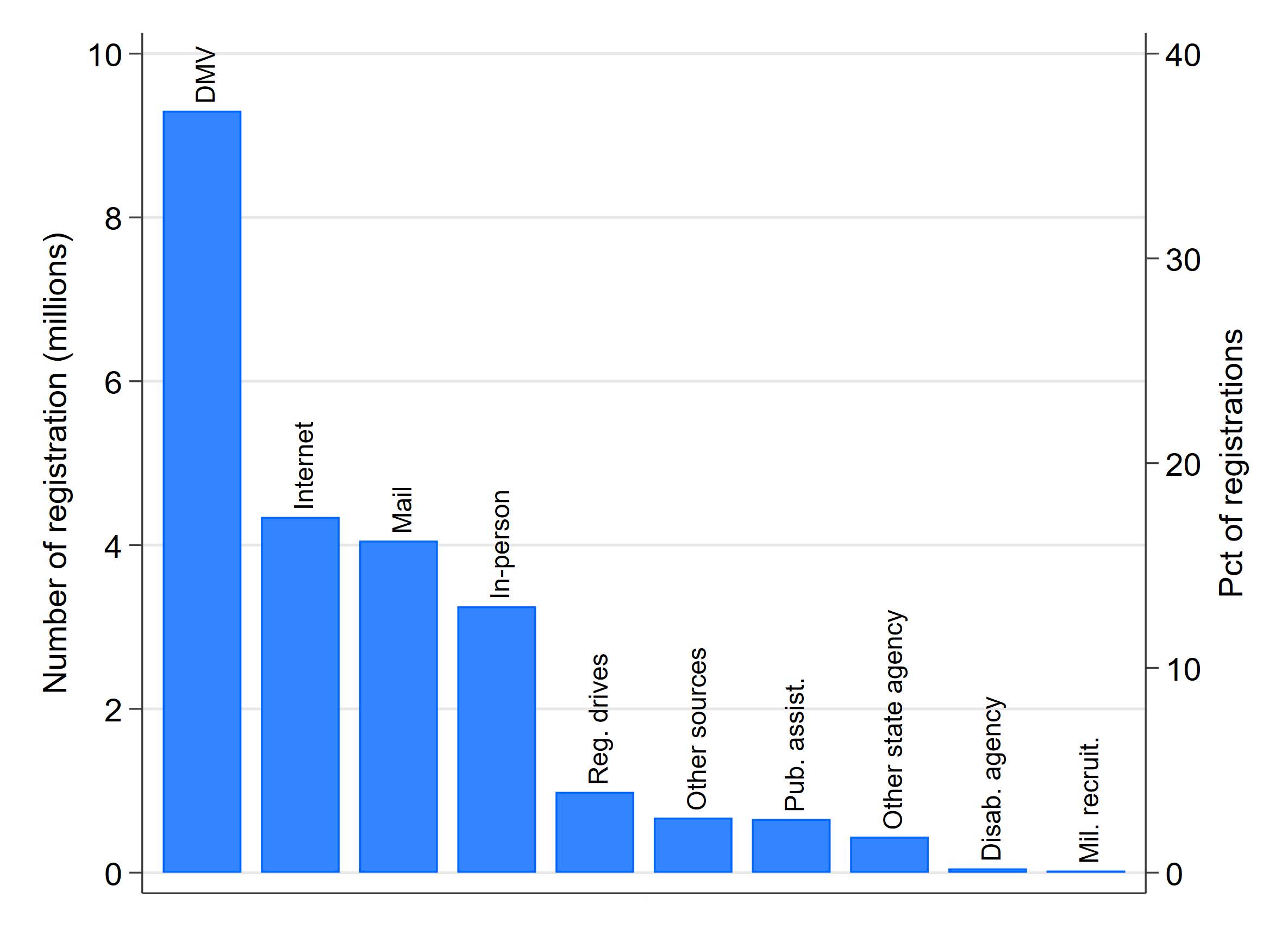
Election agencies are the custodians of voter rolls, and thus registration statistics.  However, relatively few registrations occur at election departments.  Every two years, when the Election Assistance Commission (EAC) files its report to Congress about implementation of the National Voter Registration Act (NVRA), it provides the sources of new registrations, as reported by the states.  As the accompanying figure shows, in the 2015-2016 report, the most common source of the nation’s 29 million new voter registration applications was motor vehicle agencies (DMVs), which supplied 39% of new registrations.  Just 14% of registrations occurred in-person. (Click on the graph to get a larger view)

(These statistics are based on the sources of registrations reported by states; registrations that are not attributed to a source are excluded from the percentage calculations.  Nearly 18% of the new registrations were not attributed to a source, which is a sign that voter registration statistics reported by the states to the EAC are not always forthcoming. In the 2015-2016 NVRA report, eight states failed to report the sources of registrations altogether, and one only reported the source of about half.  This isn’t evidence that the underlying registration records themselves are inaccurate, but it is of concern among those who believe that public reporting is an important source of accountability in the maintenance of voting rolls.)

Between 2015 and 2016, 15% of all new registrations came through the Internet, even though barely half of the states allowed registration via the Internet.  As the number of states offering Internet voter registration grows, it’s reasonable to expect the Internet to rival DMVs as the top source of new registrations.

How accurate are the registration rolls?

If the voter rolls are inaccurate, their usefulness is diminished — voters and poll workers face hassles at the polls, polling places are inadequately supplied with ballots, voter information pamphlets are mailed out wastefully, etc.  However, it’s not clear precisely how accurate the lists are — there are no commonly accepted auditing standards, and the results of the audits that do occur are rarely publicized.

The 2016 Survey of the Performance of American Elections (SPAE) provides one answer to the question of how accurate the voter lists are.  Of the respondents who voted in person, 2.2% said they encountered a registration problem when they went to the polls.

The SPAE responses are consistent with the number of provisional ballots cast in 2016. Provisional ballots are intended as a safety net when rolls are inaccurate, and so might be used as a proxy to indirectly gauge the accuracy of voter lists.  According to the EAC, about 2.5 million total provisional ballots were cast in 2016, which is about 1.8% of turnout.

This 1.8% rate of provisional ballot use might be taken as an upper bound on the rate of severe errors on the lists.  I say “upper bound,” because some states use provisional ballots just to update address changes — it’s not clear if these should be counted as errors — or to handle an in-person voter who had been sent an absentee ballot.  I say “severe error,” because without access to a provisional ballot, many of these voters would have been turned away at the polls, without even a chance to vote.

On the other hand, about a dozen states offer election day registration.  In those states provisional ballots are much less likely to be used because registration problems are often resolved by the voter registering on the spot and then casting a ballot.

Not all errors are severe enough to prevent voters from voting, but they could be serious enough to cause other administrative problems.  They might also cause a false match if one were comparing voter registration rolls from two states.

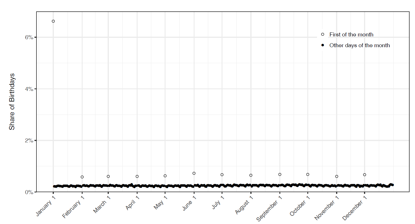
One important error relevant to interstate matching is birth-dates.  It is a little-known fact to the general public that voter registration files sometimes have placeholder birth-dates. Some voter registration systems in the days before computers didn’t retain the birth-date of the voter.  Nowadays, even when the systems retain birth-dates, the elections department might fail to record the birth-date (or the birth-date might be illegible on the registration card).  In either case, if a birth-date is missing, something is usually entered into the database.  Most commonly, that date is January 1, 1900.

A multi-campus team of researchers recently conducted research that shines light on this form of the birth-date problem.  Using a nationwide voter file supplied by a political firm, they calculated the number of people born on each day in 1970 who appeared in the file.  This is what the distribution of birth-dates looked like (Click on the graph for a larger view.):

Clearly, 6% of all voters born in 1970 weren’t born on January 1.

If we consider the purpose for which voter registration lists were constructed, birth-date errors are relatively benign — once you’ve turned 18 years old, you’ll always be at least 18.  The problem of birth-date errors becomes more important when the voter lists are used for another task, such as cross-state matching.

(Note: The problem of birth-date errors is separate from another issue raised in this research paper, which is that actual birth dates aren’t uniformly distributed.  More births occur on weekdays than on weekends, for instance.  Furthermore, some names, such as Jesus and Carol, are given to children born disproportionately on certain dates.  The clumping of birth-dates, either because of error or other factors, increases the likelihood that cross-state database matching that uses birth-dates will produce false positives, that is, match registration records that appear to be of the same person, but in fact are different people.)

Another team of researchers conducted a study of the accuracy of voter files in L.A. County and Florida following the 2008 election.  The study involved mailing letters to a sample of voters and asking them if the information on the voter rolls about them was correct.  The details of the findings are too numerous to review here.  But, among other things, 5% of the L.A. County birth-dates needed to be corrected, while only 0.3% in Florida.  In Florida, 3.5% of the sampled voters stated that their race was incorrectly recorded.  (California doesn’t record the race of voters.)  In L.A. County, 3.6% of addresses needed updating, compared to 3.8% in Florida.

The answer to the question, “how accurate are the registration rolls?” appears to be “about as accurate as they need to be, given what they were designed for.”  Because they were designed to help facilitate voters gaining access to ballots and managing other details of voting such as allocating voters to precincts, the small fraction of inaccuracies in items like name and address can normally be dealt with using provisional ballots.  Voter files were not designed for the purposes of interstate matching.  That is one reason that simple name + birth-date matches tend to yield so many false positives, that is, matches that appear to link the same person to two states’ voter lists, but in reality are inaccurately linking two different people.

Mobility and Voter Registration (Second in a Series)

(Click here for the first in the series.)

Over 16 years ago, at the first public conference sponsored by the Caltech/MIT Voting Technology Project, a European election expert quipped that America labored under the disadvantage of having never been conquered by Napoleon.

His point was that as the Little Corporal extended his administrative reach across central Europe in the early 1800s, he also extended the requirement that people register with their local governments every time they moved.  When Napoleon’s empire retreated, the registration requirement remained. With residential registration compulsory and everyone’s presence known, it was relatively easy for the government to take responsibility for registering everyone, as the franchise expanded in Europe.

Whether this rosy view of the Napoleonic wars and European voter registration is accurate, it helps frame two features of American social life that make voter registration a challenge.  First, Americans are suspicious of government authority and prize self-reliance.  Second, Americans move all the time and don’t always tell the government about it.

Except for North Dakota, in order to vote in the U.S., you need to be registered, and you need to take the initiative to tell the government you want to be registered.  (Automatic Voter Registration is changing this, but it’s still in its infancy.)  If you move from one state to another, you need to re-register.  If you move from one place to another within a state, you most likely need to re-register, and certainly change your address.

(State laws vary.  The U.S. Vote Foundation has a handy website that’s a good place to start to get more information about what the law is in each state.  A word to the wise:  don’t take anything about voter registration for granted when you move.)

Adding new people to the voting rolls

There were approximately 230 million eligible voters in the United States in 2016, according to the United States Election Project, out of a voting age population of 250 million.  (Here’s a short description of the distinction between voting-age population and voting-eligible population.)  The EAC reports that about 204 million people were on the voter registration rolls.

The most important sources of new registrations come from three sources:  people who turn 18, people who are naturalized, and adults who move.  Here are some rough estimates of the numbers associated with these three big sources of new registrations, for the four years preceding 2016, using government statistics:

  • Turned 18: 17 million
  • Naturalized: 9 million
  • Moved: 147 million
    • Of these, 81 million moved within the same county, 34 million moved from a different county within the same state, 25 million moved from a different state, and 7 million moved from abroad.

(In my next series of postings, I will write about data sources and their pluses and minuses.  For now, use these numbers to grasp the magnitude of the task.)

While an important part of voter registration is snagging new eligible voters (young people and new citizens), the big mass of people relevant to registration comes among the movers.

Removing people from the rolls

Of course, this is just the input side of the equation.  There’s an output side, as well — registered voters who lose eligibility, primarily because they die or move away.

As we’ve already seen, roughly 25 million adults move between states during a four-year period. If 70% of these adults are already registered to vote, that gives us 17.5 million registrants who need to be removed from the rolls in their former state.  In addition, according to the CDC, over 10 million adults die every four years, which means about another 7 million registrants that need to be removed because of death.

In addition to movers and the deceased, registered voters might lose eligibility due to felony convictions or being declared incompetent. Surprisingly, good statistics aren’t kept about the number of annual felony convictions or the frequency of declaring adults incompetent, so at least for now, we will set those aside.

During any given four-year period, roughly 11% of individuals on voting rolls are at risk of becoming “deadwood” on a voter roll. (The 11% figure is calculated by adding together registrants who move and die and then dividing by the number of registered voters.)   A much larger group of voters, perhaps as large as a third of all registrants, need to update their address, having moved within the state or county.

In a future posting, I will match these population statistics up with statistics reported by the EAC about list maintenance activities that correspond to these population movements.  Suffice it to say, population movements necessitate a tremendous amount of paperwork just to keep up with voters.  As well, we will see in future postings that the system as a whole does a decent job of registering voters who become newly eligible, either because of age, naturalization, or moving into a state.  It does a good job of removing voters who die.  The greatest difficulty arises in figuring out who has moved away.

On this last point, it is important to underscore the fact that when people move these days, they are often lackadaisical about notifying government. About 1/3 of Americans don’t notify the Postal Service when they move, which undermines efforts by election officials to use the mails to identify movers.  Furthermore, a recent study by the Democracy Fund revealed that about one-fifth of respondents erroneously thought that they didn’t need to re-register after an out-of-state move.

Putting it all together

 The geographic churn in the American adult population creates a record-keeping challenge for the system of voter registration in the United States.  It is a system that must keep track of 204 million people, most of whom will need to change something about their registration status from one presidential election to the next.  Most know about their obligations to update their registration when they move, but a sizable minority doesn’t.  Most at least tell the Postal Service they have moved, but a sizable minority doesn’t.

This churn is what gives us the snarky stories about Donald Trump’s youngest daughter and advisors being registered in multiple states and letters to local election officials suggesting that there are too many people on their voter rolls.  It is also what is leading many states to create more seamless connections between the voter rolls and other state databases, like the driver’s license file, and to embrace Automatic Voter Registration.  And, it is also what has caused the Electronic Registration Information Center (ERIC) to expand, as it provides a valuable tool to election officials who are trying to keep up with their voters.


Voter Registration Lists: How Big Is “Too Big”? (First of a Series)

The Presidential Advisory Commission on Election Integrity (PACEI), also known as the Pence-Kobach Commission, has been the most controversial development in the world of elections and election administration in 2017.  There are many explanations for why PACEI has been appointed, theories about its agenda, and predictions about its possible effects.

To wrestle these considerations into an election science frame, one could argue that the world of the PACEI revolves around voter registration. Of the three parts of the Commission’s mission, the third is to report on “those vulnerabilities and practices used for Federal elections that could lead to improper voter registrations and improper voting…” Central to this point is the questions of whether voter lists contain people who don’t belong on them, and whether the lists are just too inaccurate.

The Public Interest Legal Foundation (PILF — the most unfortunate acronym in all of election administration), which is headed by Christian Adams, one of the most active members of the PACEI, brought this question to a head last month by sending notice letters to 248 counties that had reported voter registration rates greater than 100% of the estimated voting-age population.

Clearly, a registration rate greater than 100% is bad optics, but is it evidence of malfeasance in maintaining voter rolls or, even worse, of inadequacies of the National Voter Registration Act (NVRA)?

The right answer to this question is, “it’s complicated.”  To help shed light on the question, over the next few weeks I will publish a series of posts that lay out, from my perspective, the issues involved in answering it.

For now, the planned series of posts will cover the following topics.

  • The problem of population mobility. The biggest challenge facing high-quality list maintenance is that the American population is highly mobile.  This affects not only the issue of ensuring that people who have moved away are promptly removed, it also is a major hurdle to getting Americans registered.
  • The problem of data. Controversies that erupt over the size and quality of voter lists turn on what the data show.  Yet the data that are brought to policy fights about voter list quality, both the registration data and data about populations, are imperfect.  Understanding the sources of these data and their limitations will help to place some of the empirical questions in their proper context.
  • The law. Voter registration and voter roll maintenance are governed by laws, most notably the NVRA. The NVRA places limits on when, and why, voters might be removed from voter rolls.  Obviously, this will put a break on the removal of some registrants who have moved away, but by how much is an interesting question. (And, just as important, how many people are kept on the rolls who are still eligible, but haven’t voted recently?)
  • Population dynamics and registration I. With some basics established, let’s look closer at the data.  Because the fundamental mission of registration lists is to facilitate voting, we’ll start by comparing underlying population dynamics (births, migration, and naturalization) with the number of new registrations in states and counties.
  • Population dynamics and registration II. Now, let’s examine the relationship between population movements and list maintenance. Here is where we will encounter most directly the source of the 100%+ registration problem, in the difficulty of removing people from the rolls who have moved out of jurisdiction.
  • What should the future bring? The purpose of this series is to heighten awareness of the myriad issues associated with assessing the quality of voter rolls.  But, it also will provide opportunities to pose issues that the research and election administration communities may want to consider in the coming years.

Some of these topics will take more than one post to get through the basics.  I welcome you to the ride.

As Doug Chapin likes to say, stay tuned…


Ansolabehere and Hersh Provide Insights Into Voter List Matching (and Smart Policy Advice)

My friends and colleagues, Stephen Ansolabehere and Eitan Hersh, have just published an article with the journal Statistics and Public Policy with the sexy title, “ADGN: An Algorithm for Record Linkage Using Address, Date of Birth, Gender, and Name.”  I highly recommend it.  Here are a couple of thoughts about the paper and why it’s important.

The paper does two major things.  First, it provides an easily implementable matching algorithm for people doing work in this field.  Second, it provides important guidance about how states might think about protecting personally identifying information while at the same time making voter lists public.  Data geeks will be interested in the first thing; everyone should be interested in the second thing, especially as the community struggles with the privacy implications of the voter registration list requests made by the Presidential Advisory Commission on Election Integrity, also known as the Pence-Kobach Commission.

Background

First, the article’s background.  The article arose from expert work Ansolabehere and Hersh did working as social scientists the Department of Justice in two Texas voter ID cases that arose under the Voting Rights Act, Texas v. Holder and Veasey v. Abbott.  Denizens of election administration and election science recognize the importance of these cases for the ongoing controversy about the implementation of strict photo voter ID laws.

What may be less appreciated is that the empirical work that Ansolabehere and Hersh had to conduct confronted (at least) three challenges:  (1) the Texas voter registration file does not contain the race of the voter, (2) the databases to be matched did not contain the full nine-digit Social Security Number (SSN9), which is the gold standard of matching criteria, and (3) the Texas voter file and the associated ID files (driver’s licenses, passports, and many others) are enormous.  The first challenge had to be surmounted so that they could draw conclusions about any racially disparate impacts of the ID laws.  The second and third challenges had to be surmounted if the question about the racial impact of the voter ID law was to be addressed empirically.

Leaving aside the first challenge, matching databases in a setting like this is tough because of the sizes of the data sets in question.  Many record linkage algorithms have been developed in the context of relatively small data sets — or at least one small data set being matched against one large one.  Because of the necessity to minimize both false positive and false negative matches — for good substantive and strategic reasons — and the need to meet tight litigation schedules, the standard linkage algorithms that academics have developed and applied in other settings aren’t easily used in Voting Rights Act cases.

On top of all this, from the perspective of getting high-quality matches between voter registration and ID data bases, let’s just say the data can be a bit messy.  Typos, name changes, inconsistent data-entry standards, etc. plague the data set matching effort.

The ADGN algorithm

The solution Ansolabehere and Hersh offer to the matching problem is to build matching terms based on combinations of the house numbers and ZIP Code from the Address, Date of Birth, Gender, and Name.  In the best of circumstances, if we have perfect data in both data sets to be matched, then the combination of all four elements (ADGN) almost perfectly uniquely identifies someone in the two data sets being matched.  Perhaps even better, when the data aren’t perfect, most of the triples of these elements create matching keys that are almost just as good, such as ADN (excluding gender) or ADG (excluding name).

The following graph (Figure 1 in their article) shows the degree to which different combinations of the ADGN elements create unique identifiers in the Texas voter file.

Ansolabehere and Hersh are able to take advantage of the fact that a subset of the Texas voter file did have the full SSN9.  Thus, they were able to compare matches that used SSN9 to merge the voter file with the driver’s license file with matches that used the ADGN algorithm.  As they state in the abstract to the article, they show “that exact matches using combinations A, D, G, and N produce a rate of matches comparable to 9-Digit Social Security Number.”

The policy contribution

Eitan Hersh, the author of the very fine book on voter registration lists, Hacking the Electorate, has become a leading light thinking through the ethical implications of making voter lists available to the public in the age of big data.  Thus, it’s not surprising that an article like this also has some very smart thoughts about the policy of releasing voter lists to the public.  Releasing voter lists to the public is a necessary part of maintaining the integrity of the voting process, conducting campaigns, and doing research into the electoral process.  However, the full lists — the ones maintained by election officials for the conduct of elections — contain personally identifiable information that no one wants disseminated widely.  How do we balance the need to disseminate voter lists with the need to protect voters against identity theft?

Ansolabehere and Hersh conduct detailed analysis of the degree to which the data elements in a typical voter list help to identify individuals.  They show that if you have the full name, gender, date-of-birth, and address of a voter, you pretty much can identity that individual perfectly in any other data set you might match against.  However, if you mask name and then only report birth year, it becomes very hard to identify individuals in a voter file — the combination of birth year, gender, the ZIP5 only uniquely identifies 0.42% of individuals in the Texas voter file, for instance.

Of course, the parties — along with academics who use the files as sampling sources — would squeal if states removed the names from the voter files made available to them.  However, a voter file without names and only ZIP5 (plus, perhaps precinct) for address would be all that most election science researchers and voter integrity activists need to do their work.  Certainly, as states re-think their policies about the public release of voter registration lists, using the Ansolabehere-Hersh paper to think about wise data redaction policies is a better route to take, rather than just simply refusing to release any form of voter files altogether.