News comes that North Carolina’s State Board of Elections and Ethic Enforcement has chosen not to certify the results of the 9th congressional district race, which was (provisionally) won by the Republican Mark Harris over Democrat Dan McCready by 905 only votes. News accounts provide speculation that this is related to “irregularities” among absentee ballots in the district. Because North Carolina has such a great collection of election-related datasets, I thought I’d dive in quickly to see what we can see.
(For the data geeks out there, go to this web page, and enjoy!)
My interest is guided by a number of statements that have appeared in news sources and filings with the SBOE. Among these are:
- Charges of an unusually large number of mail absentee ballot requests in the “eastern” part of the district, especially Robeson and Bladen Counties.
- Charges that an unusually high proportion of mail absentee ballots were unreturned.
- Charges that “ballot harvesters” were gathering up ballots and collecting them in unsealed envelopes (presumably allowing the harvesters to fill in choices on the ballot and then submit them).
What do the data show? Here are some quick takes. This is certainly not the last word, but reveals what one can glean from the SBOE’s public data.
Number of ballots by county
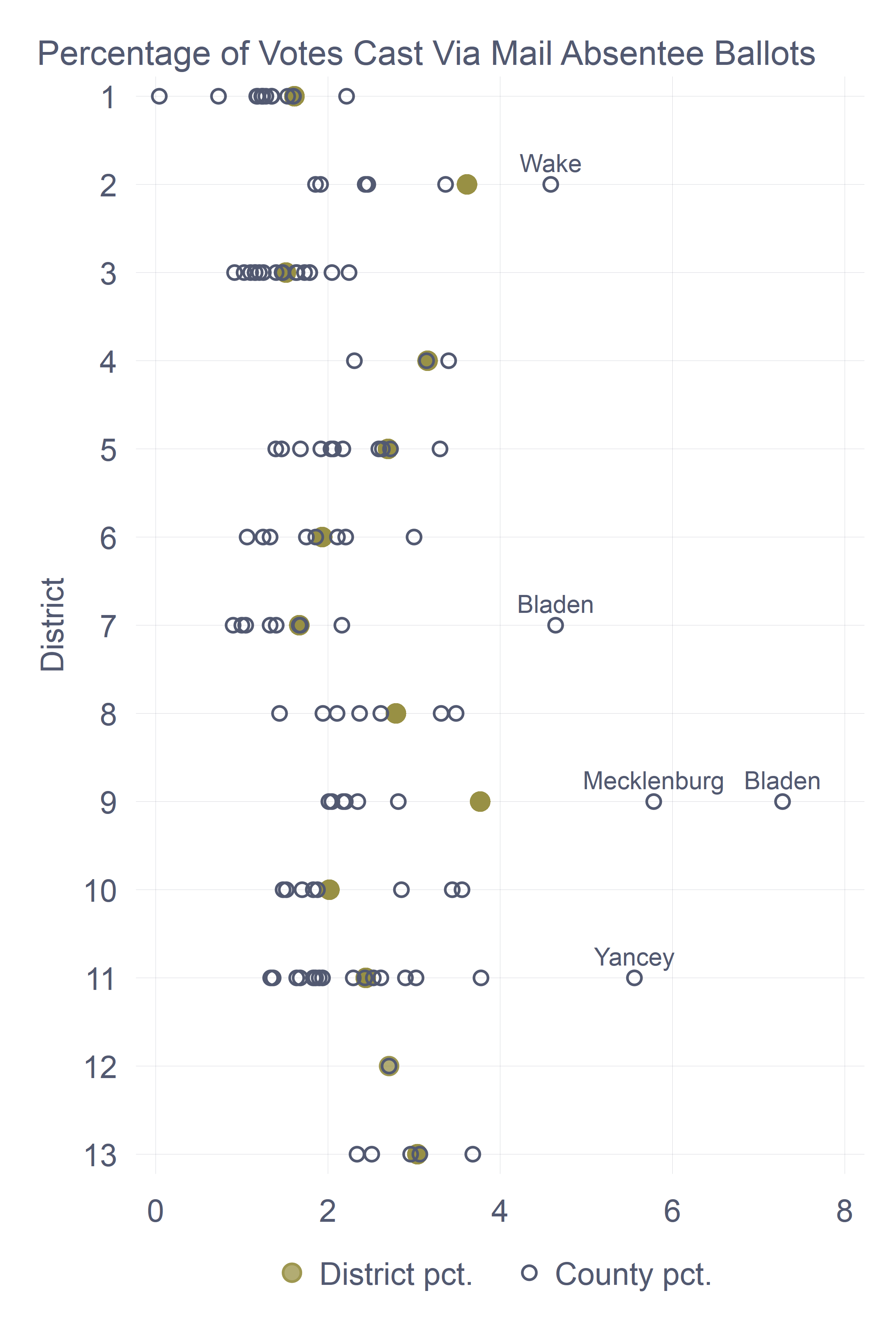 It certainly is true that Bladen County had a disproportionately high level of absentee ballot usage in the 2018 congressional election, but it goes beyond Bladen County and beyond the 9th CD. The accompanying graph shows the percentage of votes that were cast by mail absentee ballots for each district-county unit. (For instance, Mecklenburg County is in two districts, so it appears twice in the graph, once for each district.) The part of Bladen County that is in the 9th District did cast the highest percentage of mail absentee ballots in a congressional race, at 7.3%. In the entire district, 3.8% of ballots were cast absentee. And in the part of Bladen County that is not in the 9th District, a lower percentage (4.6%) was cast by mail.
(As with all the graphs in this post, you can click on them to enlargify them.)
Note, however, that Mecklenburg County also cast a notably high percentage of mail ballots in the race — 5.8% of all votes. Also, because Mecklenburg is about ten times larger than Bladen, it turns that that its absentee ballots (over 5500) swamped Bladen’s (nearly 700).
Finally, it should be said that one other county, Yancey, is an even bigger outlier, if what we’re looking for is a comparison of mail absentee ballot use with the rest of a district. Nearly six percent (5.6%) of Yancey’s votes were cast by mail, compared to 2.4% in the rest of the 11th district.
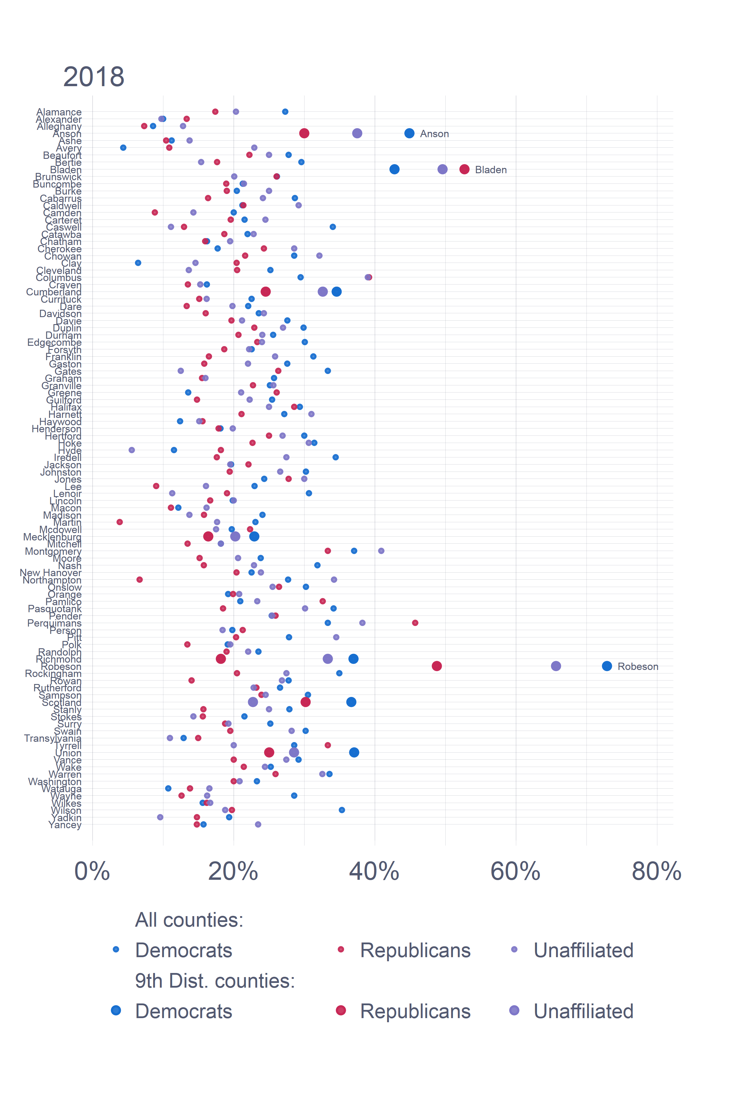
Party composition of ballots by county
 For absentee ballots to have a major influence on the outcome of a race, they need to overwhelmingly support one of the candidates. Here, we encounter even more interesting and unexpected patterns.
In this case, the accompanying graph has two parts. The left part is a scatterplot of the percentage of the two-party vote given to the Democratic congressional candidate in all mail absentee ballots (y-axis) against the percentage of the vote given to the Democratic -congressional candidate in all ballots. Again, the unit is the county-district. The red dashed line is set to 45-degrees (ignoring the aspect ratio). Most counties are above the red line, indicating that in most counties, Democratic congressional candidates did better in the mail absentee vote than they did in the other voting modes. The data tokens are clustered around the line. There are outliers, to be sure — a few counties are below the line, where Republican candidates actually out-performed in the absentee ballots, and a few are well above the cloud of circles.
The right part of the graph pulls out the counties that are part of the 9th CD. There are three counties of note (at least) in the graph. The first is our friend, Bladen County, which is identified here as one of the few counties in the state in which the Republican congressional candidate actually did better in the mail absentee ballots than in the other modes. No wonder Democrats were suspicious. At the same time, Union and Anson Counties are outliers on the other side of the equation. Union County’s absentee ballots were 21 points more Democratic than votes overall.
As an aside, in the part of Bladen County that is in the 7th congressional district, the Democratic share of the mail absentee vote was 86.6%, compared to an overall Democratic share of 61.3% in that part of the county. It makes one wonder whether the Democrats and Republicans were concentrating their efforts to get their supporters to cast mail ballots at opposite ends of the county.
Unreturned ballots
 This is where it gets interesting. Some of the speculation that has been floating around suggests that there was a significant number of unreturned mail absentee ballots in the district. This has been attributed to a number of things. It could be that political activists were requesting ballots for voters without their consent, and those ballots simply went unreturned. Another possibility is that “ballot harvesters” were going door-to-door asking people to give them their ballots — and then maybe not delivering them to the county.
I looked at the percentage of requested mail absentee ballots that were never returned for counting, and sure enough, Bladen and Robeson Counties stand out. The pattern stands out in the accompanying graph, which really needs to be enlarged to be fully appreciated. (Again, you can enbiggify the graph by clicking on it.) The graph shows the percentage of mail absentee ballots requested by Democrats (blue dots), Republicans (red dots), and unaffiliated voters (purple dots) that were unreturned in each county. I have made the dots associated with the counties in the 9th district a bit bigger. Statewide, about 24% of mail absentee ballots were not returned after being requested — 27% of Democrats, 19% of Republicans, and 24% of unaffiliated. In Anson, Bladen, and Robeson Counties, the nonreturn rates were 43%, 47%, and 69%, respectively.
Robeson County stands out, because not only is the overall nonreturn rate high, but the partisan discrepancy is so high, as well. The overall nonreturn rate 69%, but it was 73% for ballots requested by Democrats and 66% for ballots requested by unaffiliated voters. Still, the Republican nonreturn rate was also unusually high, at 49%.
Some news accounts remarked that Robeson County officials started noticing batches of absentee requests being delivered in August, and started keeping track. This made me wonder whether the unreturned ballots were associated with these batch requests. To explore this, I calculated the percentage of mail absentee ballots that were unreturned, based on the week of the year when they were requested.
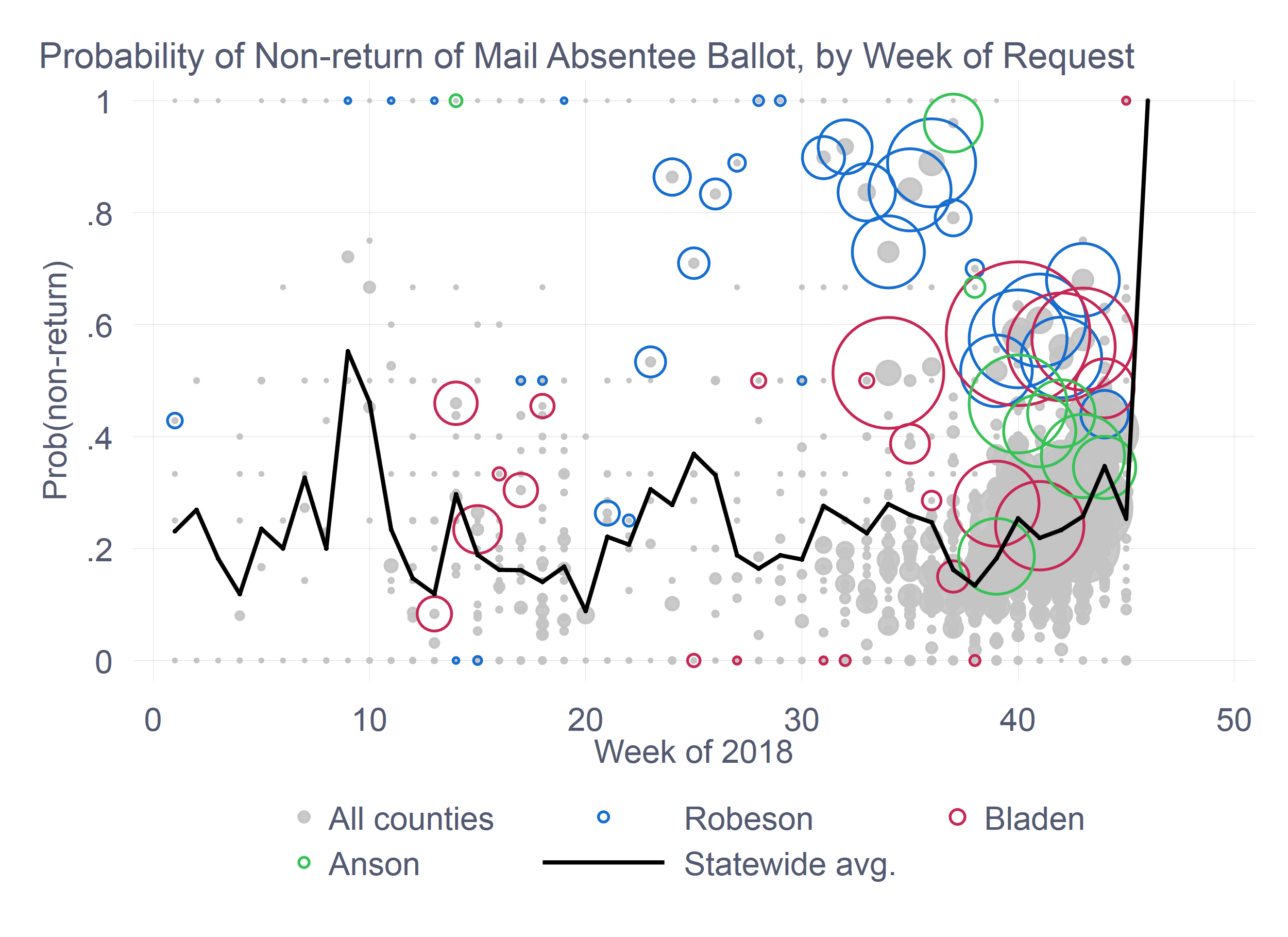 That led to the accompanying graph. The grey circles represent the fraction of mail ballots requested each week of 2018 that ended up not being returned for counting, in each county. Note that the grey circles become a grey blob toward the end. The black line shows the average nonreturn rate for the whole state, as a function of the week when the ballot was requested. The hollow blue circles represent Robeson County. Note the large number of unreturned ballots that appear after week 30 — the August period noted before. After Labor Day, the nonreturn rate in Robeson fell, although it was still high by statewide standards.
I’ve also shown the Bladen and Anson nonreturn rates by week. We don’t see the same patterns in these counties that we see in Robeson.
Some concluding remarks
The purpose of this post has been to show the reader the type of numerical exploration one can engage in, using data provided by the North Carolina elections board on its incredible data page. The analysis seems to confirm the suspicious that “something’s going on” with absentee ballots in the 9th district, but it also suggests complications that aren’t always clear from news accounts. It seems quite likely that the campaigns — or individuals acting to support them — targeted absentee ballots in some counties, and not just in the 9th district. (I have generated similar graphs to the ones shown here for the 2016 election, and there are some stories to be told…) Whether this was just a small bit of tactical political warfare or something more nefarious, we’ll have to wait to see.